As a user, you interact with buttons, menus, and other clickable elements on a website or app.
These elements are called targets. If the target size is too small for the element, it would be difficult to tap/click on it. If it’s too big, the interactive area might overlap with other clickable objects and you might accidentally tap/click the target next to it.
Either situation will leave you frustrated, frantically rage-tapping to no avail.
In this article
What is a Target Size in Digital Product Design?
A target size is the area around a User Interface element where users tap/click to interact with it. Anything outside this area isn’t interactive.
It’s called different things by everyone, but we’ll stick to “target size” to be clear:
- Apple: Hit target
- Google Material: Touch target
- Design community: Clickable area
It’s important to know that the devices your users use will affect the target size because of the various screen sizes and input types. That’s why Flexy always researches user devices and behavior before designing the UX.

Apart from knowing what your users use to interact with your digital product design, you should also consider their mobility needs to make the product accessible.
Imagine your user is commuting to work in a shaky metro cart (or Subway/Underground however you prefer to call it) it would be hard for them to tap on a small icon in the menu.
The situation is trickier for people with involuntary tremors, missing limbs, or other disabilities.
To address their needs you’ll need to get acquainted with Apple accessibility standards, Google’s Design for Driving, and the WCAG 2.2 regulations. We’ll talk more about these in a bit.
Why are target sizes important?
Let’s explain the importance of sizing and spacing using a real-life example.
Do you have the Instagram app?
If you do, you may have noticed that the ‘X’ buttons to dismiss ‘Follow’ suggestions were quite small and hard to select even though they were spaced away from the “Follow” button.
Because of this UX and UI design, it is easier to ignore these suggestions rather than risk accidentally following an account.
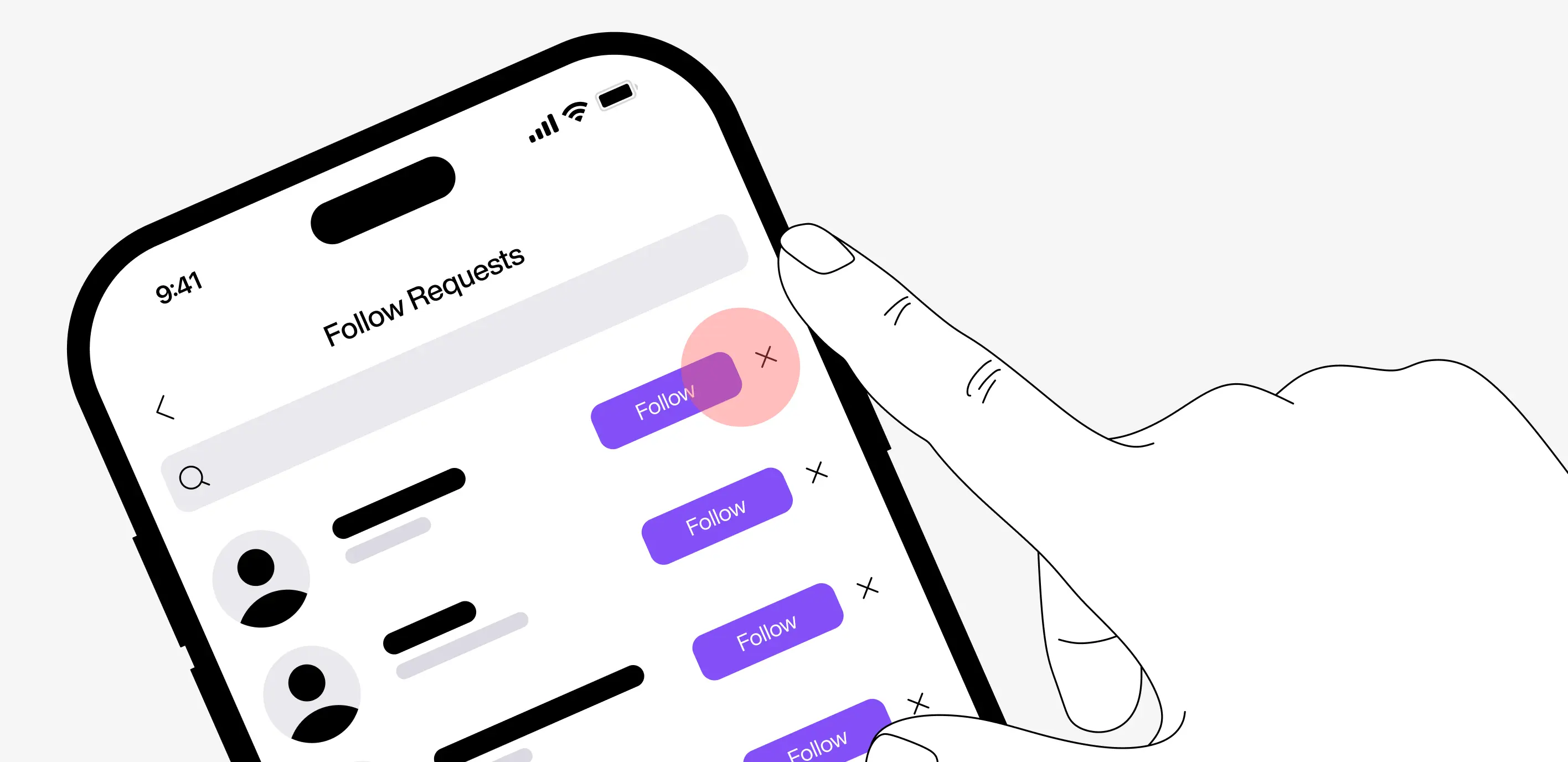
This example visually shows that target sizes are crucial for digital product usability.
UX Tips For Target Size
#1 - Minimum target size
The minimum target size needed to pass the WCAG 2.5.8 guideline is 24 x 24px. But it is advised to make it 44 x 44 CSS pixels for easier navigation. The only exception to this rule is if the target is smaller than 24px but has ample space around it.
There are, of course, many standards for the minimum target size, and each platform has its own.
- Google Material — 48 x 48 pixels
- Android — 44 x 44 pixels
- Apple — 44 x 44 points (not px)
- Microsoft — 40 x 40 pixels
- BBC — 32 x 32 pixels
Remember that these are the smallest possible targets users can easily interact with.
We advise making target sizes at least 44px and leaving a minimum of 10px between touch targets.
If you have a 24px menu icon, the area around it where the user can tap or hover can be a comfortable 44px.
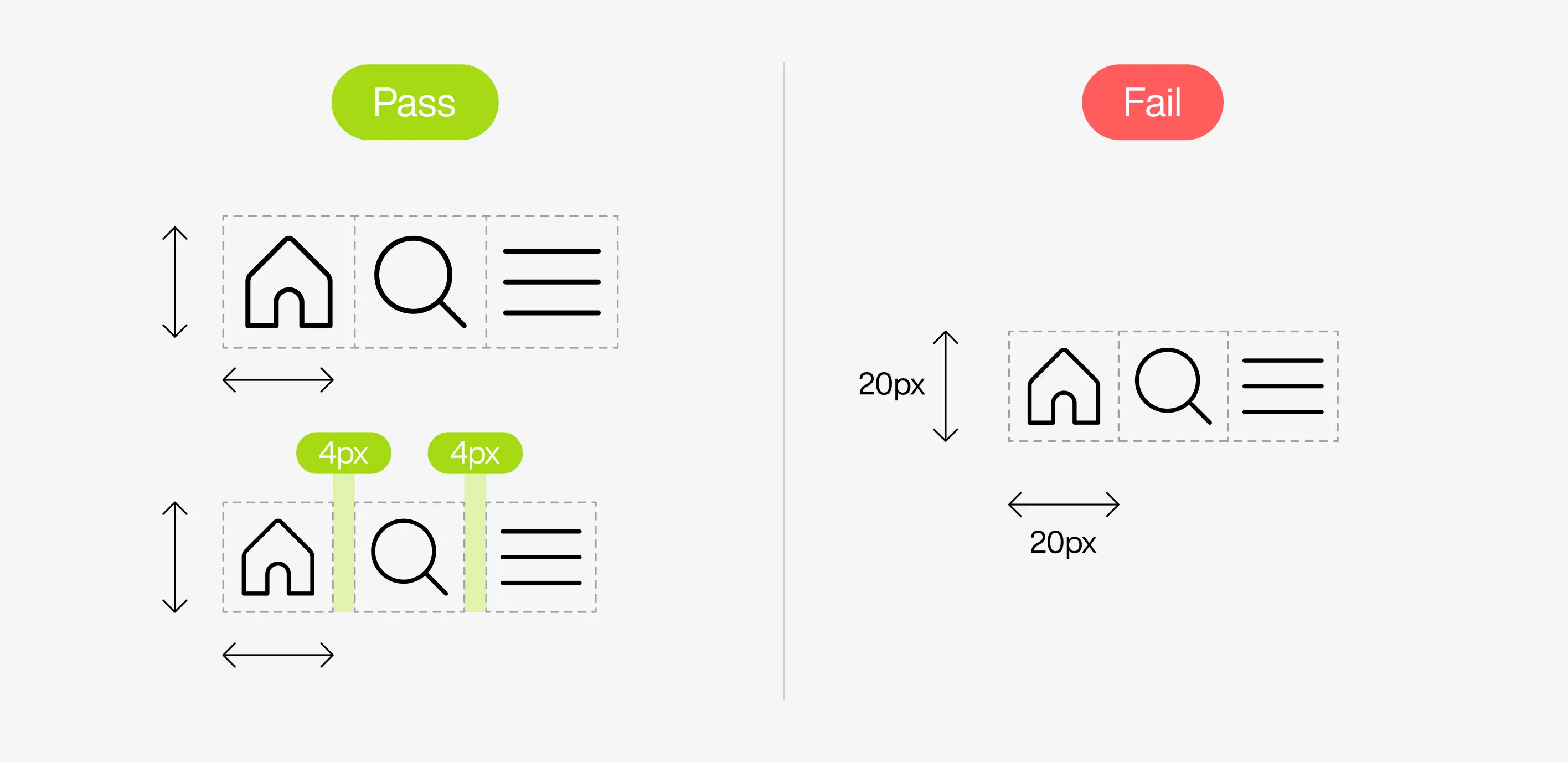
If your team isn’t bothered to follow the WCAG guidelines strictly, we suggest a general rule of thumb: a 1cm touch target size, as advised by the NNG. The downside is this only applies to devices with touch inputs (i.e. smartphones, tablets, and some laptop models).
#2 - Spacing
Each target should have enough space around to prevent accidental clicks/taps on nearby targets.
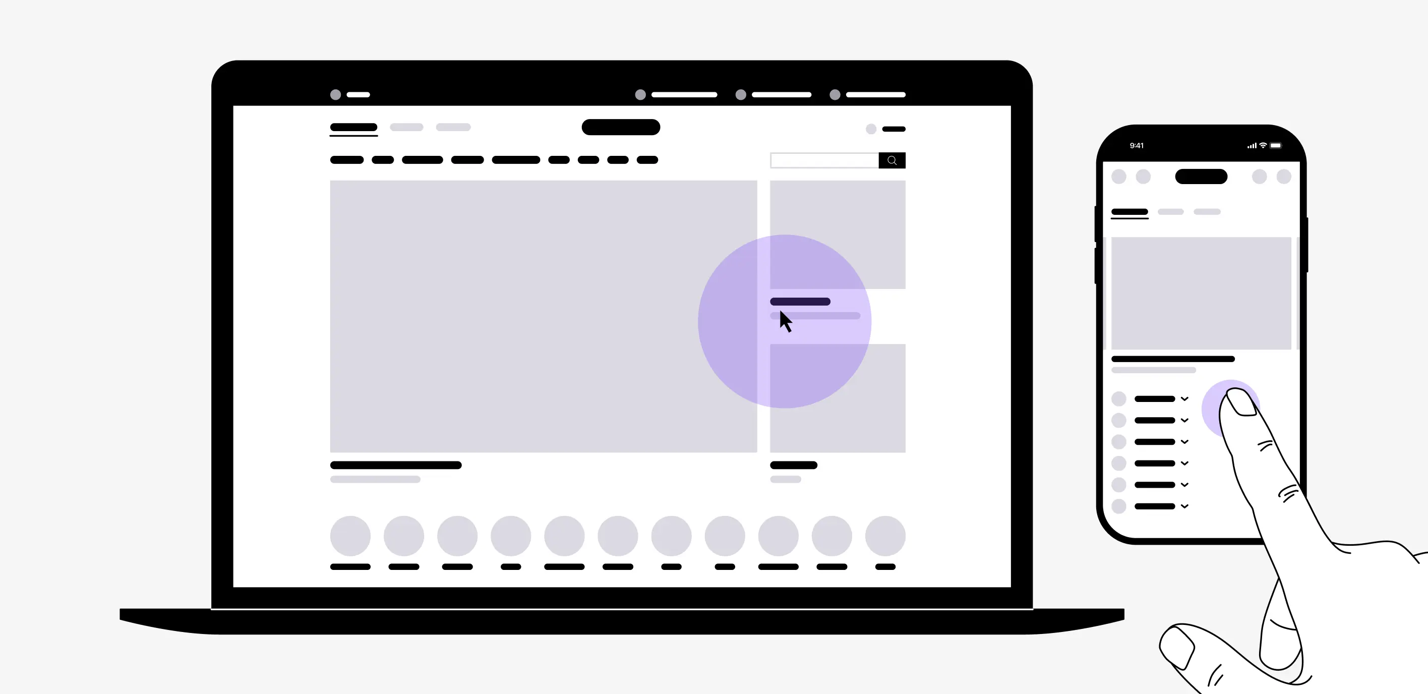
But the WCAG says that a row of 24px targets is a “Pass,” so what’s the problem? Let’s look at the example below, where the circle represents a person’s thumb. See how it simultaneously touches two buttons?
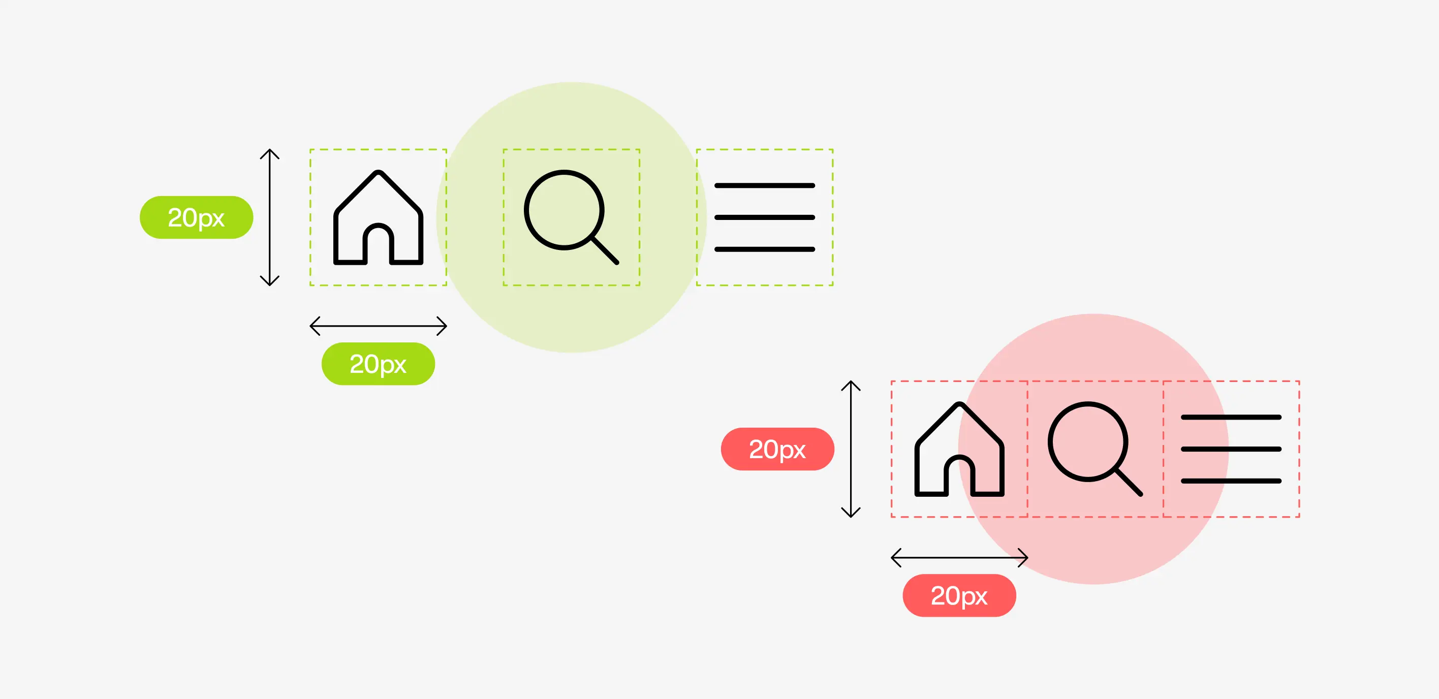
This means the target size is not enough to prevent user frustration and rage-tapping. We need to space the elements.
There is no set standard for the target spacing because it largely depends on your UI design, but here are some numbers:
- An MIT study found that the average touch size of an index finger is 1.6 to 2 cm (or 45 - 57 pixels).
- The average width of a thumb is 2.2 cm (or 75 pixels).
We suggest you go for a 48 x 48dp touch target size (the responsive part of an element), with a minimum of 8dp spacing in between.
Small targets need more spacing.
If there are multiple small targets with little spacing, they will fail because users will have a hard time tapping/clicking them.
Here’s a real-life example. The like and “Reply” buttons in Instagram’s comment section are smaller than WCAG’s standard but they still work because they have lots of space to prevent unwanted interactions.
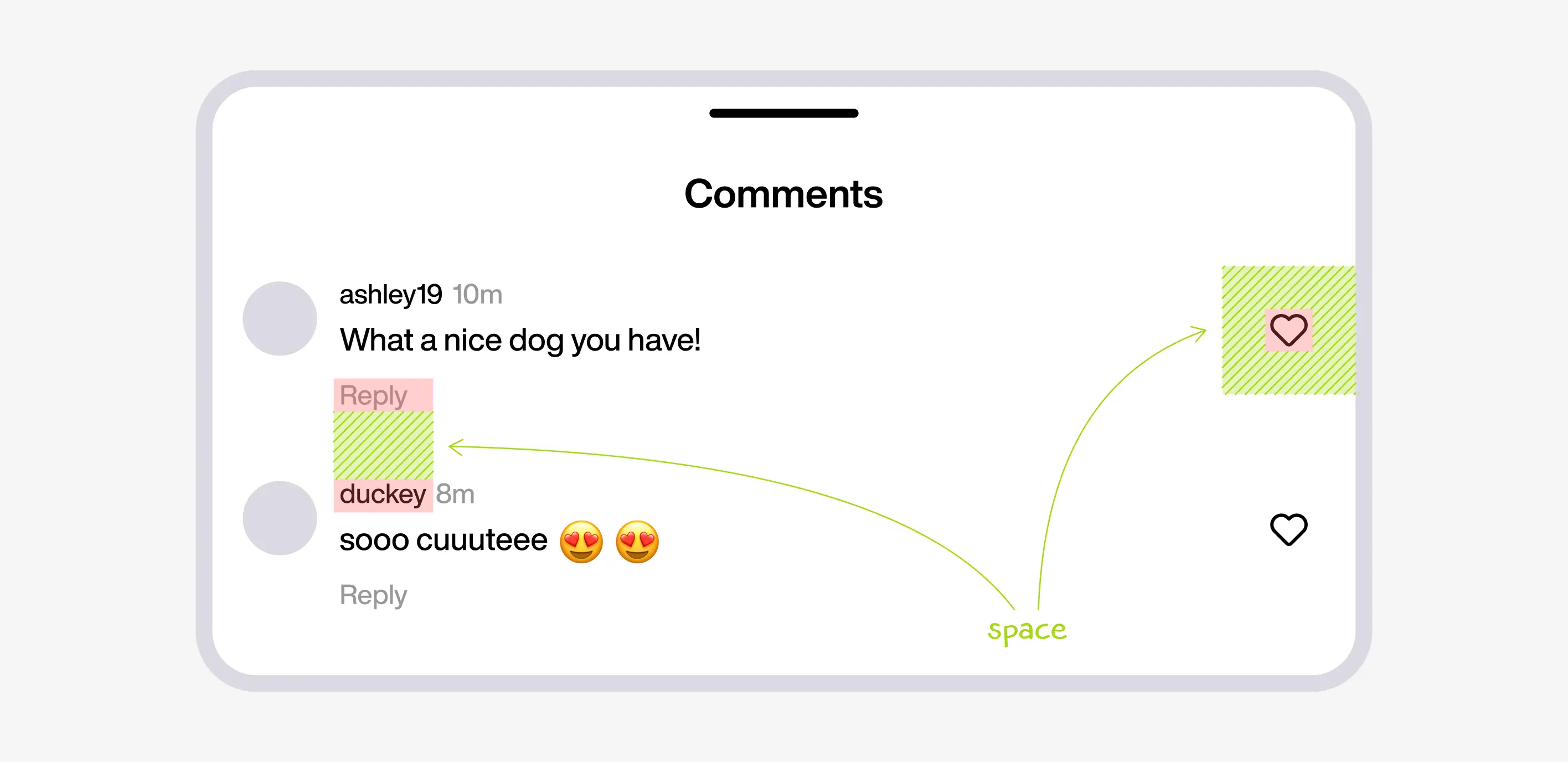
Large targets need less spacing.
The bigger the target size, the easier it is to tap/click, which means that space or padding is unnecessary. Too much space around a large target can also throw off the visual balance of your UI design.
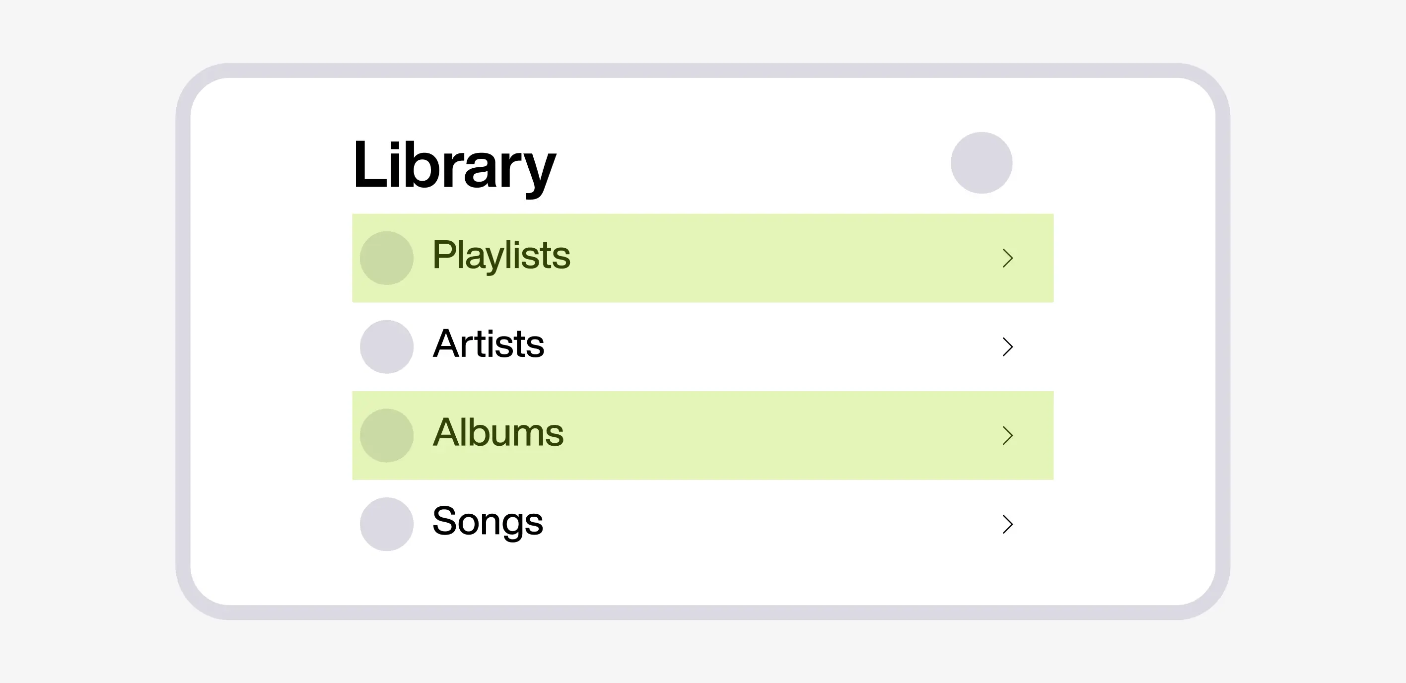
In the example below you can see that the Apple Music app designed the menu targets to be conveniently big enough to tap/click with no extra space in between.
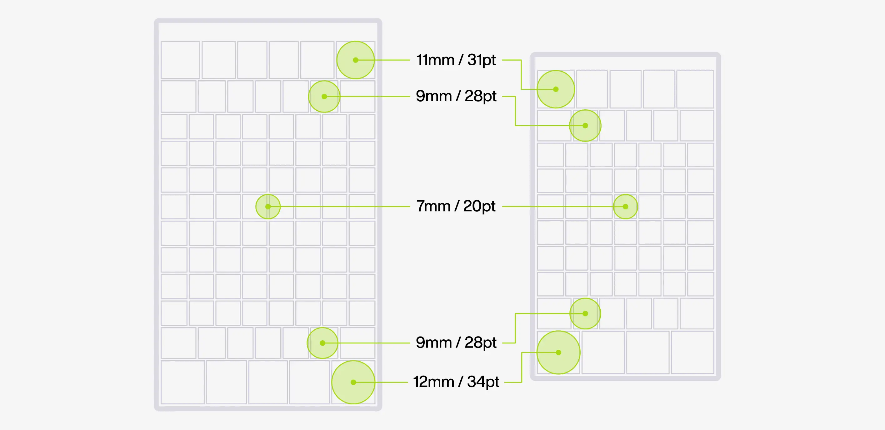
According to Steven Hoober, depending on where an element is placed on a mobile screen, it will need more or less padding. Based on his research, people are usually less precise with their taps on the edges of their mobile screens (top and bottom).
Hoober advises a 42px target padding at the top of the screen and a 46px padding for elements at the bottom of the screen. He even came up with a touch target size cheatsheet:
#2 - Using Fitt’s Law
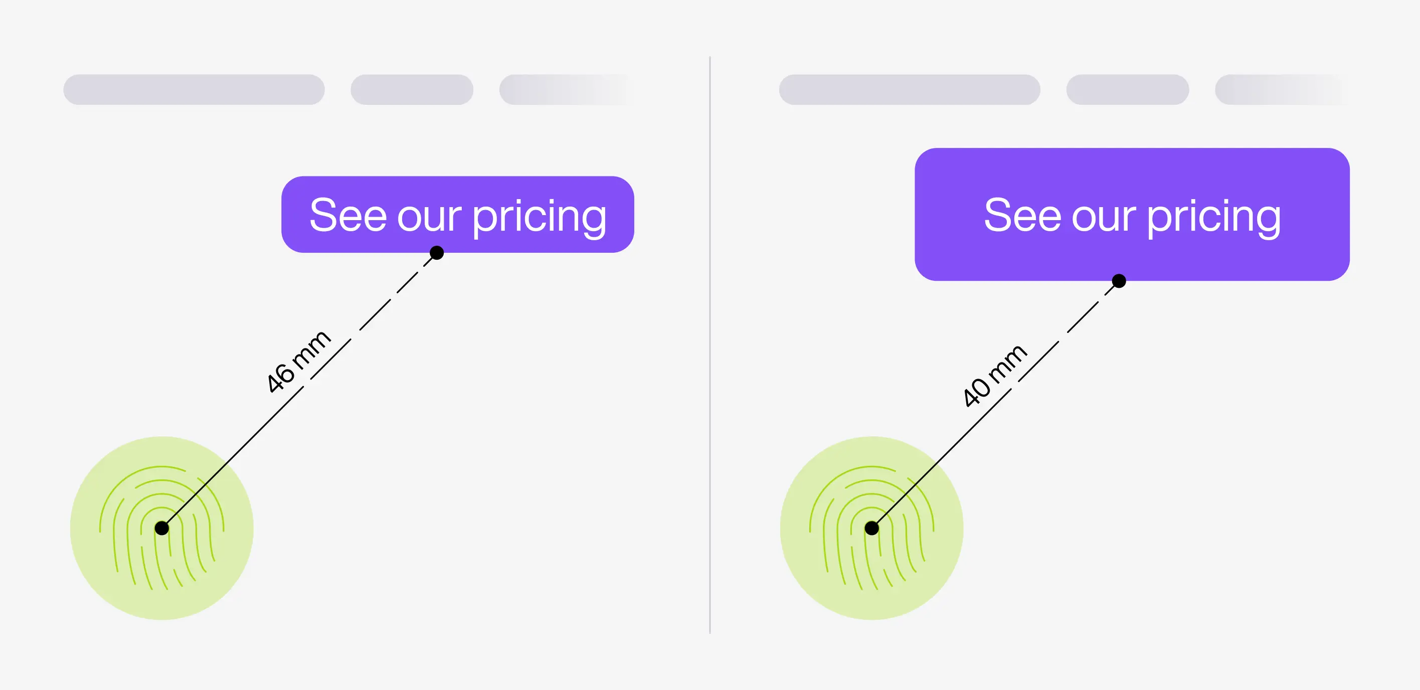
The bigger a call to action, the faster and easier it is to touch/click.
Basically, if there’s a button that you want the user to click first or make it easy to access, make the target size bigger.
Picture a basketball player trying to shoot in a hoop the size of a basketball compared to a hoop the size of 3 basketballs. The bigger the hoop, the shorter the distance is between the player and the hoop, making it easier to score.
It’s the same principle in UX design.
Large target sizes can be used for a range of reasons such as:
- A primary call to action (CTA)
- Large screen sizes.
- Young kids
- Users driving or walking
Fitt’s Law is handy when creating a digital product design that could be used while driving, like a GPS map application.
When you’re driving a car, you only have a few seconds to tap something, which means that your attention and touch won’t be very accurate. The target size must be larger to be ”glanceable” and easy to tap in a short amount of time.
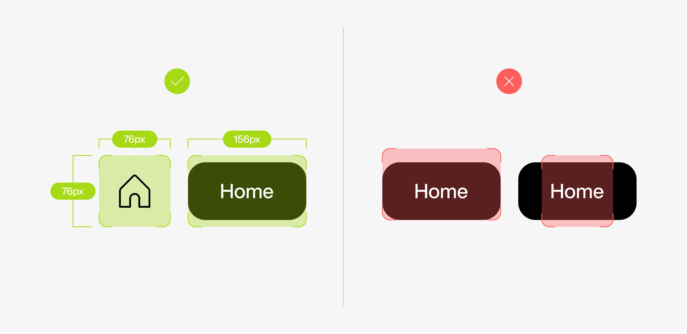
The Google Design for Driving guide recommends a minimum 76dp x 76dp touch target.
The size is suggested as density-independent pixels because it is a flexible unit that is scalable to fit different screen sizes.
Google also advises positioning the element within the target boundary and making it centered so that users can interact with it at any angle.
Tips From Flexy
#1 - Consider The User’s Device
Although the WCAG gives a 44-pixel passing size, these pixels can appear different larger or smaller on different screens.
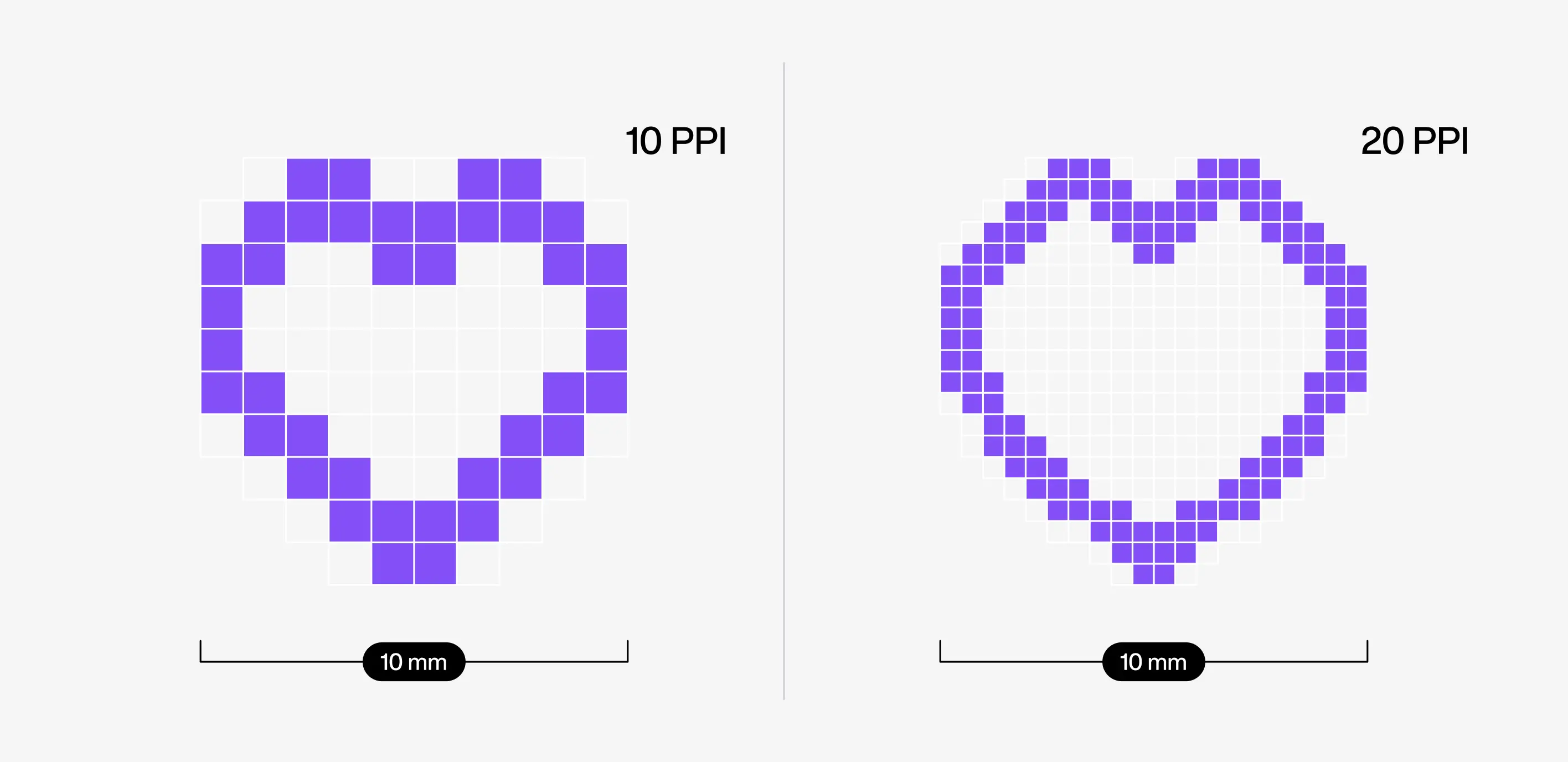
For example, a 44-pixel target area on an iPad is 8.25 mm but on an iPad Mini it is just 6.75 mm. This means, that a user’s experience will be quite different when switching devices.
As designers, it’s important to create a digital product design that has the same usability regardless of device size. The design must adapt to screen sizes.
#2 - Adjust the modal dismiss button target size
A modal (or lightbox) is a web page that pops up on the screen and deactivates other page contents until a user completes an action or closes it.
What size should the ‘close’ target be?
Let’s say you have a small ‘close’ icon and you don’t want to change it to keep the visual balance, make sure that the target area is larger than the icon itself. We can easily do this in Figma by placing the ‘close’ icon within a Target component and using it in the design.
{{component_quote}}

#3 - Make navigation mobile-friendly
A comfortable scrolling experience on mobile is very important because users will be more interested in exploring more content. This is especially critical for e-commerce apps and websites.
A great real-life example is Amazon’s scrollable “You might also like” section. You can see in the figure below that while a user can side-scroll the product cards, users can easily look through products without covering details with their thumbs using an extra bit of padding below the cards.
Our tip here is to test your digital product design and evaluate its usability. After all, not all designs will need extra space under scrollable sections, it all depends on the navigation. But if in doubt, a little more spacing has more benefits than drawbacks.

#3 - Avoid view-tap asymmetry
As a rule of thumb (pun intended), the user’s touch should not obstruct their view of the page’s contents. This means that if they toggle an option or filter results, the target items should be placed in a way that they can interact with them while seeing the changes on screen.
Here’s an example of this situation below. In the left figure, the person’s hand/thumb covers the content and in the right figure, target items are under the content and allow a clear view of the changes.

Targets that work just fine on a desktop can be less intuitive on a touch screen. Why is that?
Navigation tends to be more precise on a desktop but a user’s touch can be clumsy when the digital product design is used on a mobile device.
Desktop designs that are not fully adapted to a mobile touchscreen can create view-tap asymmetry.
Users don’t have a small cursor and tap in the general area where they hope the button will react.
Let’s look at an example that you can find on Facebook. The slider arrows are small on their own, but the users might tap anywhere along the left and right sides of the digital product design.
So, what can we do to make the navigation easy for mobile users? Extend the target size with pseudo-elements to make sure users can interact with the product at any angle.
#3 - Design visual target feedback
Visual feedback in UI is a response to a user’s interaction to show its success.
This responsiveness is important because it helps users understand how the product works and if their actions have succeeded or failed. It is especially useful for elements without boundaries, where users cannot see where they should tap/click to interact with them.
For example, menu buttons can change color when hovered over. This will be a hint for where the target area boundaries are, which guides their next action.
Tips for modal dismiss buttons
If your ‘close’ target is designed to fit inside the modal, I don't recommend making the icon too large because it will throw the design off balance and attract too much attention to something that you wouldn’t want users to interact with right away.
Another way you can increase the target size is by taking Meta’s example and using a target that is right on the corner, just like in the example below.


