Building an Intuitive IFRC Application
“We are very thrilled and excited about the design that was delivered. We can’t wait to see it deployed in a few weeks. I would like to thank the Flexy team for jumping into what was probably an unfamiliar sector, with a lot of acronyms and processes. Everyone delivered the best experience.”
— Kanhong Lin, Product Manager at the IFRC
At the core of every humanitarian organization is its commitment to serve and work towards public or social welfare. To provide services and information efficiently, global humanitarian organizations need applications that make content easily accessible to the users.
The goal of such applications is to meet the humanitarian organization's needs. Our job as designers is to create a professional, trustworthy, and user-friendly design for smooth and intuitive interaction.
The International Federation of Red Cross and Red Crescent Societies (IFRC) is guided by seven Fundamental Principles: Humanity, Impartiality, Neutrality, Independence, Voluntary Service, Unity, and Universality. As the world's largest humanitarian network reaching 160 million people annually through long-term services, development programs, and disaster response, its principles and values are as important as practical user flow.
Our challenge was to design a user interface that adapts to different languages and color selections while incorporating robust accessibility features to accommodate users of many nationalities, age groups, and people with disabilities. To come up with a solution, we had to conduct thorough research and analysis.
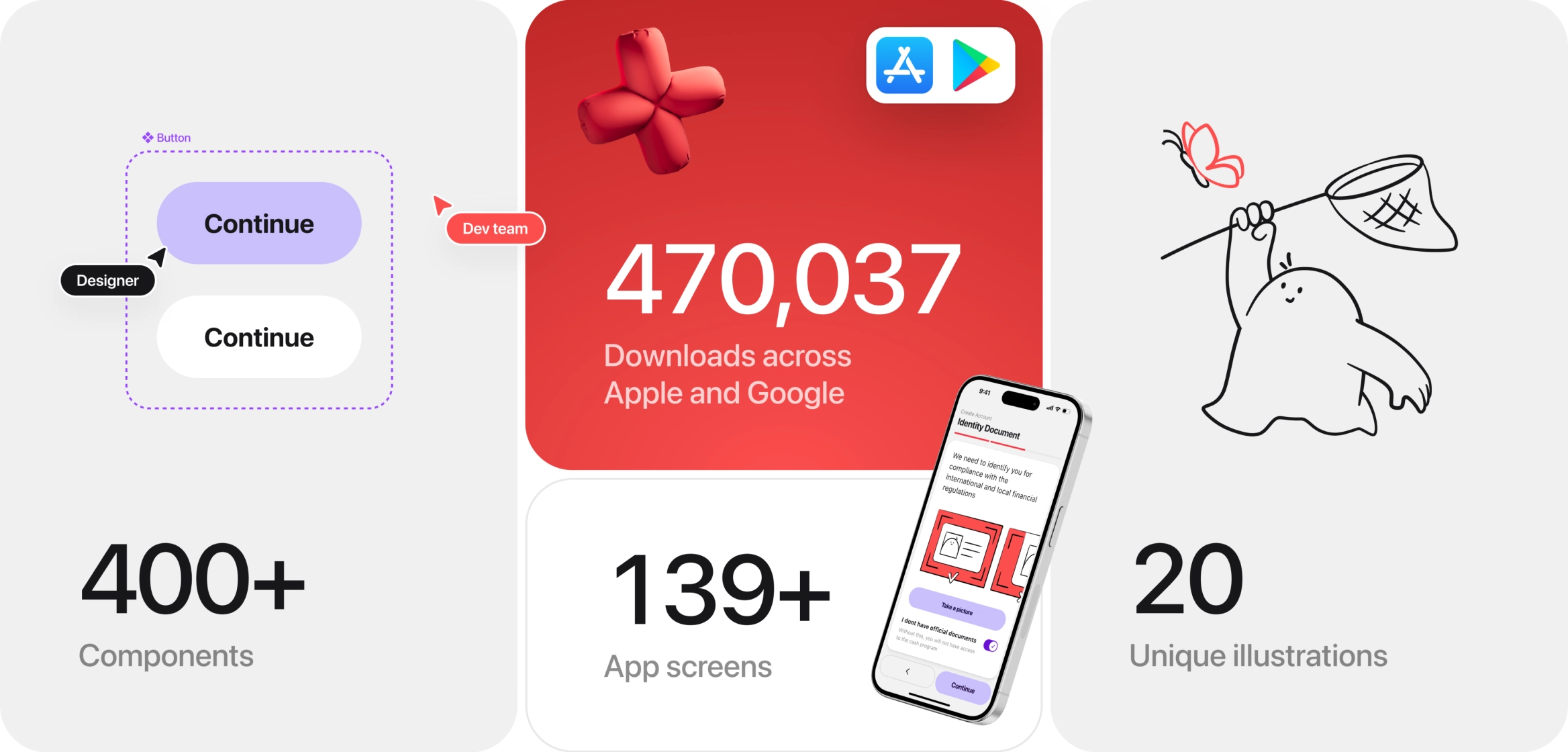
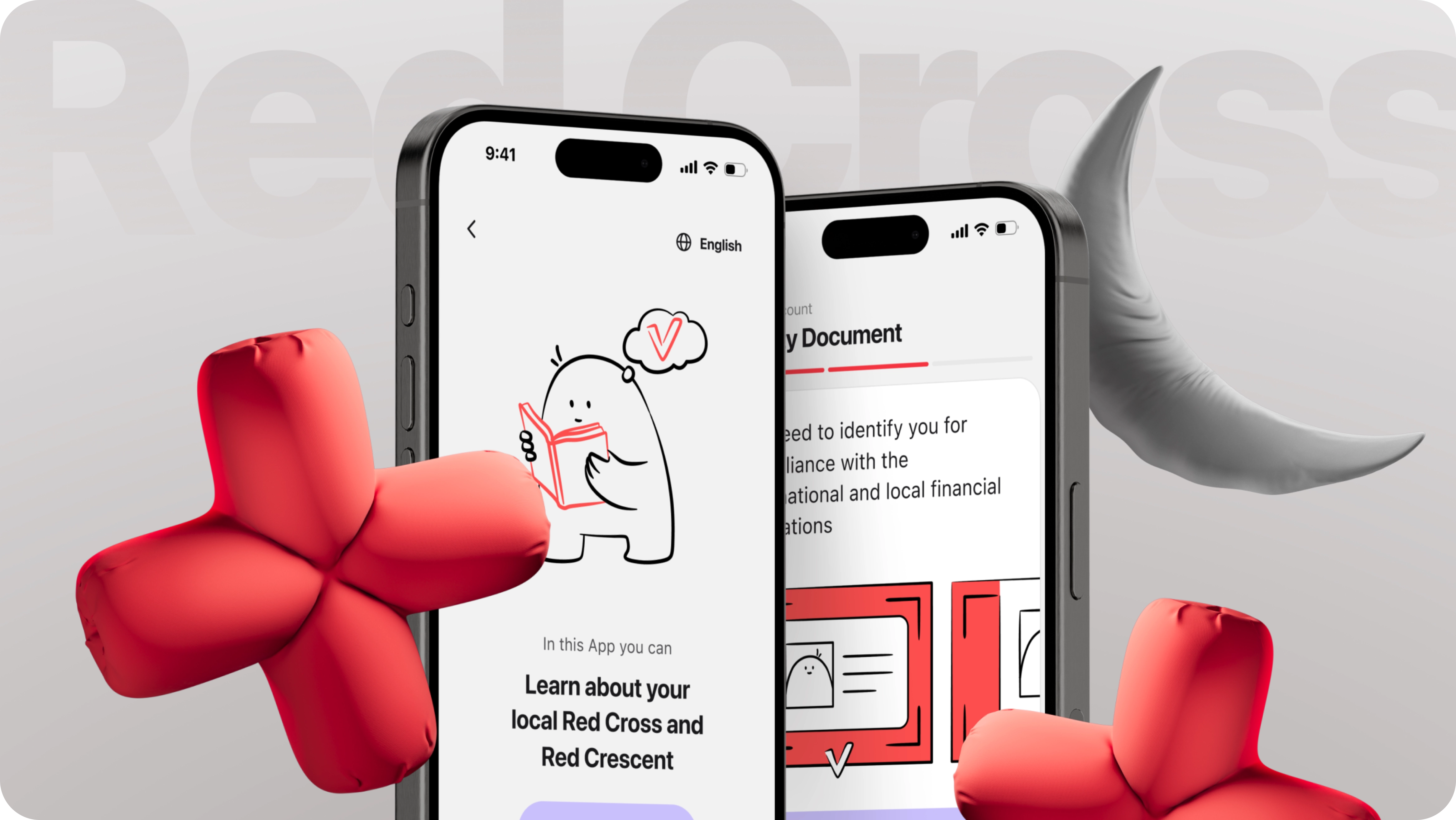
The IFRC app redesign has delivered impressive results, thanks to a collaborative approach and a strong focus on user needs. We created over 400 components to ensure consistency and scalability within the design system. The addition of 20 unique illustrations, including a playful mascot, enhanced engagement and brought the app to life. With more than 470,000 downloads on Apple and Google platforms, the app has been extremely well-received. Thanks to its streamlined processes and improved interactivity, the app now provides an intuitive and visually appealing experience, making it easier for users to access the IFRC’s valuable programs.
What Does the IFRC Do?
The world’s largest humanitarian network, the International Federation of Red Cross and Red Crescent Societies (IFRC), works to support vulnerable people and improve their lives before, during, and after disasters and health emergencies.
The network unites 191 Red Cross and Red Crescent Societies worldwide, offering support through its global secretariat.
The Red Cross and Red Crescent are built on empathy and humanity. Likewise, great designers need empathy to understand and meet their users' needs, making it a key trait in both areas. That’s why we feel especially proud, honored, and happy to have had the chance to work with the IFRC and contribute to its mission.
Our Challenge
Flexy’s task was to help redesign the IFRC’s existing application used by different branches globally. We assessed the app's design and found ways to improve its usability and accessibility, with the ultimate goal of helping the organization meet its humanitarian goals.
Our challenge was to improve user experience (UX), making it more intuitive and easy to navigate, and design an inclusive UI for a multicultural audience.
The IFRC has a wide target audience that may have varying levels of education and tech proficiency. This means that app design had to adapt to different user needs.
Our Scope:
- App Audit
- User Flow Correction
- Sign-up Flow
- Homepage
- Programs
- Program Application forms
- Help Center
- Connections Page
- Inbox
- Pop-up templates
- Colorblind UI Kit and more
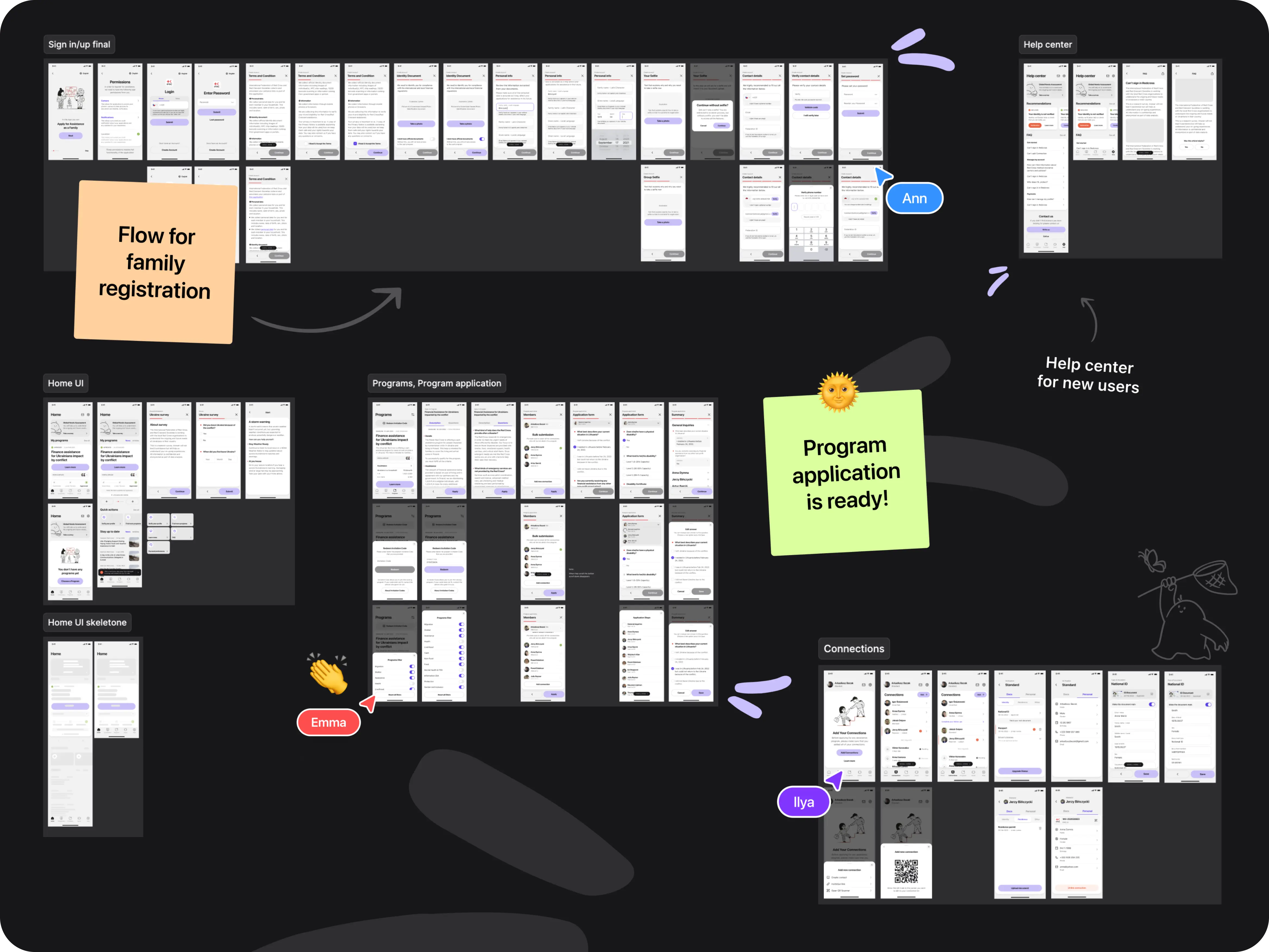
The Project Roadmap
This project took place in 2023 and spanned 8 weeks during which our incredible designers produced a total of 139 screens!
As it often happens with big organizations IFRC had tight deadlines. Flexy team took on the challenge and proudly delivered the project in time while keeping in touch with the stakeholders and continuosly improving on received feedback.
The Flexy team held daily sync-up chats and meetings with the stakeholders to ensure we were moving in the right direction. As the calls were frequent and the clients were very involved, we were able to iterate fast and stay aligned with the client's needs.
We began by developing user flows and wireframes in the first week, which established a clear foundation for the design process. Moodboard creation and concept development followed in weeks two and three, setting the visual and thematic direction. The design phase ran from weeks four to six, during which accessibility considerations and a comprehensive UI kit were implemented. The project concluded in weeks seven and eight with the addition of illustrations and final client feedback, ensuring the design was visually appealing, inclusive, and adapted for color-blind accessibility.
Improving the Structure
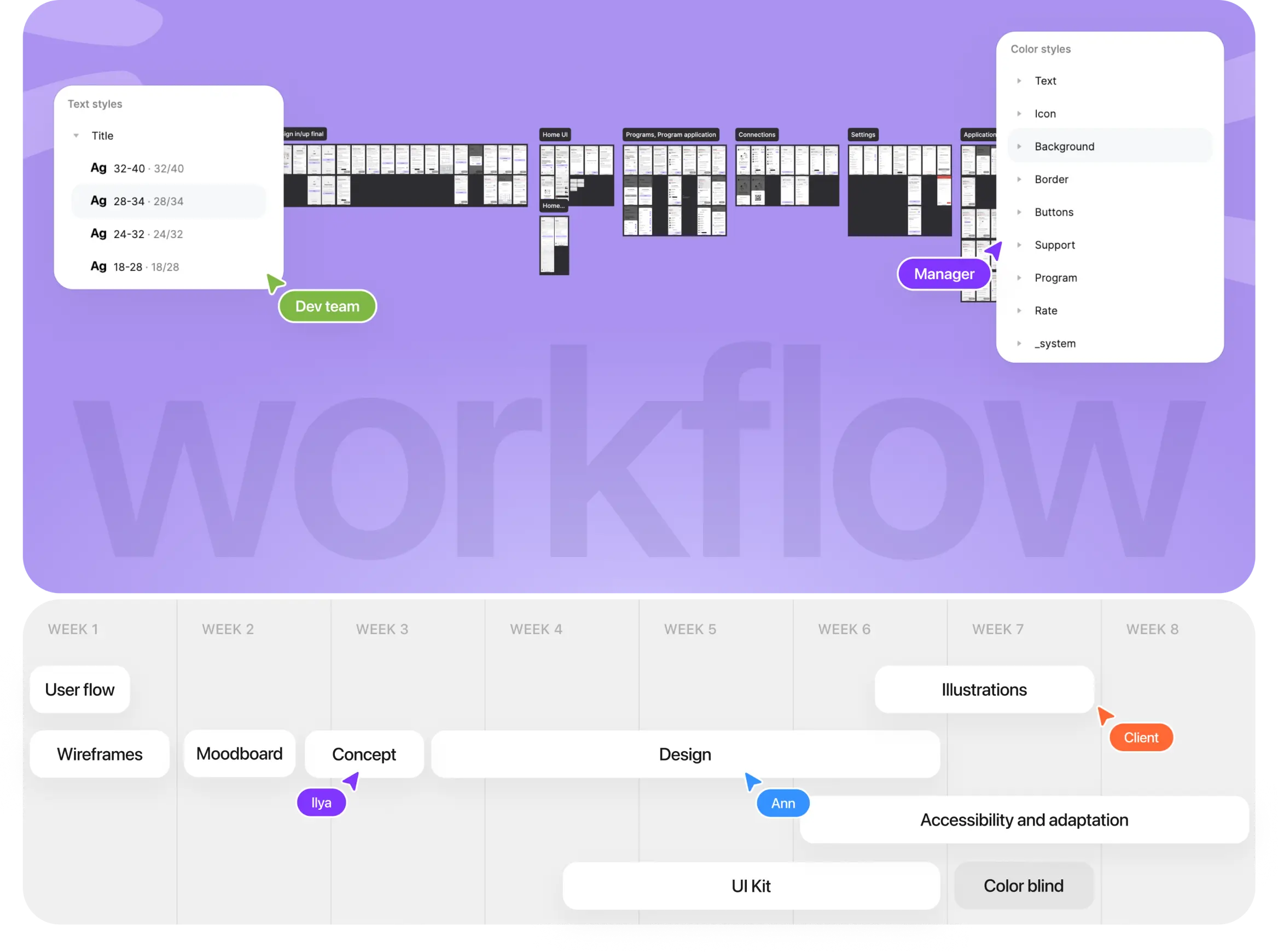
Consistent collaboration with our client was one of the highlights of this project. After conducting a UX/UI audit and refining the user flow within a week, we identified key pain points and implemented meaningful improvements.
A major enhancement was the introduction of a homepage that brought together essential IFRC items like surveys, application status, program previews, news, and articles in one place. This eliminated the need to navigate through multiple screens. We also streamlined the Programs page, allowing users to view key details—such as deadlines, eligibility, and assistance size—at a glance, making the app more intuitive.
Alongside that, we focused on three critical areas for improvement:
Navigation
We enhanced user navigation to make it more predictable and intuitive, ensuring users clearly understood what was expected of them and which actions to take.
Our UX design introduced new progress indicators during the sign-up process and added graphic prompts to guide users.
To simplify onboarding, we streamlined and merged some processes. For complex actions, we created smaller, manageable steps to prevent confusion or overwhelm. This was especially important in the password recovery pages.
Visual Hierarchy
One key function of various app screens is to establish the visual structure of the product.
Flexy designers created screens with a clear visual hierarchy guiding users on what actions to take and why.
For that, we placed instructions directly above text fields, added scroll icon hints to indicate hidden content, and incorporated large, easy-to-read image prompts as visual instructions.
Interactivity
Flexy designers structured screen interactions (IxD) to build user trust and highlight the value of the IFRC programs. To achieve this, we combined related actions (for example, scanning a photo and taking a photo in case of an error) and introduced new features, including returning to previous steps or saving data to complete a form later.
Giving users control and flexibility builds trust and confidence, as long as the choices are simple enough to prevent overwhelm. Additional improvements included making the verification process more user-friendly by enlarging the photo scan area and introducing a QR code option.
Simplified Sign-Up
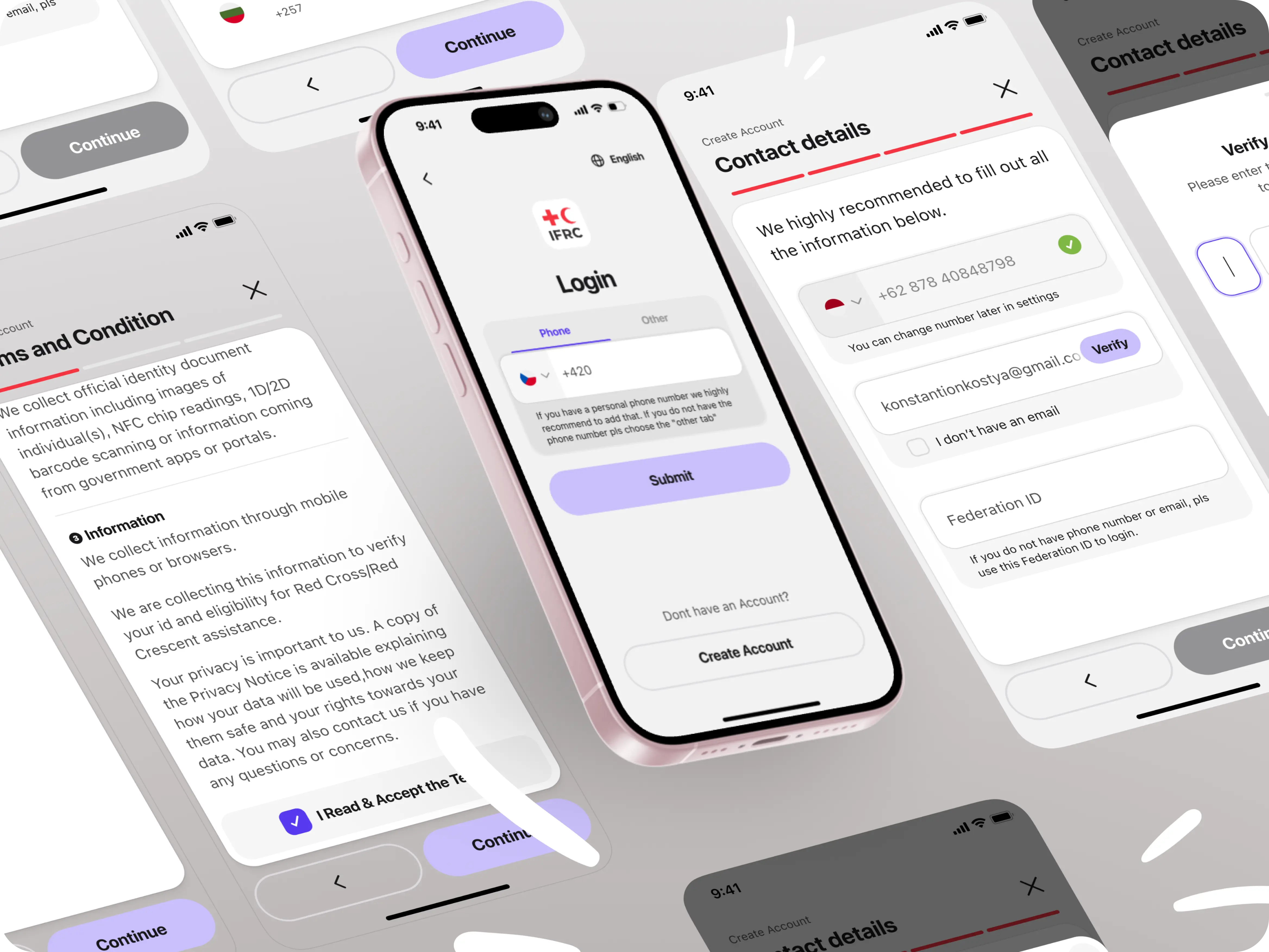
One of the most important parts of any application is the sign-up/sign-in process. A complicated and dull design with too many steps and little guidance can discourage users from applying to the IFRC programs. Flexy transformed an 8-step sign-up process into an engaging and intuitive experience that doesn’t leave users confused or frustrated.
The original sign-up process required users to complete a lengthy series of steps before accessing content. Our redesigned user flow and UX simplified and sped up the sign-in process with new features like toggles, prompts, scrolling date pickers, a country code search, and checkboxes. For example, attaching an identity document, which previously involved four steps, was streamlined into a single step.
Homepage Made Easy to Read
The goal of an application homepage is to present information in a structured way, communicate its value, provide access to other sections of the app, and share updates. The original IFRC app lacked a comprehensive homepage screen, so our designers created one from scratch to meet the IFRC's needs and goals.
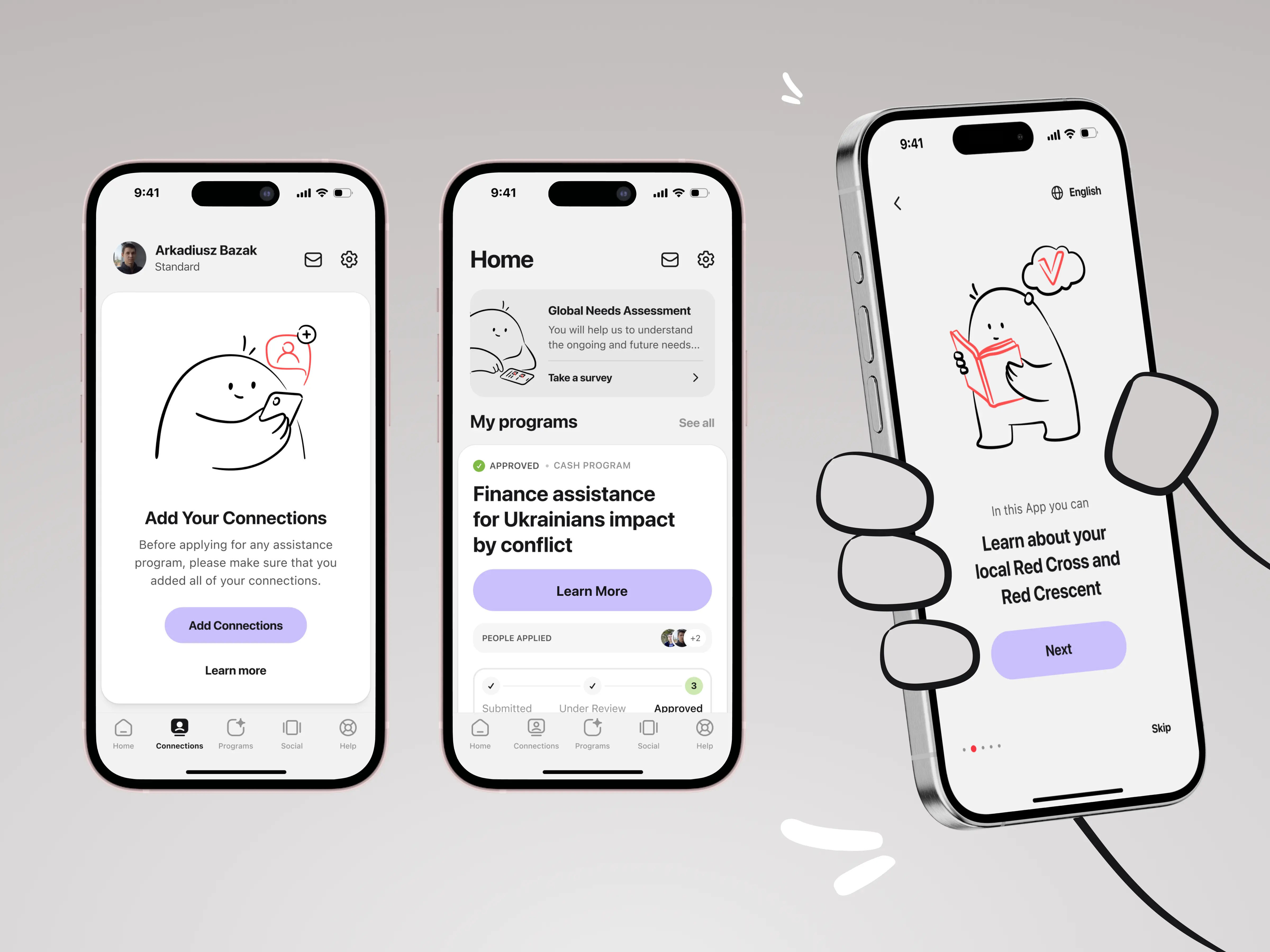
The newly designed homepage became a hub for the IFRC surveys, user programs, program approval status with a progress bar, quick profile actions, and news updates.
By combining various navigation techniques—vertical and horizontal scrolling, cards, horizontal swiping, and a right-image grid—we optimized the organization and presentation of homepage content. Now it is:
- Hierarchical: Information is presented in a clear and logical order.
- Well-spaced: Elements are visually separated, improving readability and usability.
- Effortless: Eliminates unnecessary actions.
- Efficient: Reduces excessive scrolling with interactive horizontal navigation.
- Actionable: Provides ample space for Call-to-Action (CTA) points, encouraging users to explore the app and convert.

Straightforward Program Application
The app's purpose is to enable users to easily search for and apply to programs published by the IFRC. The application process involves learning about a program, completing a form for themselves or their connection members, and submitting the application for IFRC approval. The challenge was to revamp the user experience and interface for the Programs section and the application process, making it easier for users to search, navigate, and apply.
For that, our designers moved away from the traditional card layout with brief descriptions. Instead, they introduced large blocks for each program, displaying essential details such as the deadline, cost per number of members, and type of assistance offered. These blocks also highlight which individuals from the user’s connection network have already applied.
All this information is now readily available to users before they click “Learn more,” helping them make quicker decisions about whether a program suits their needs.
Our user-centric UX/UI design ensures that users can easily filter content and complete actions without unnecessary steps. For instance, if a user already has an invitation code to redeem, they can simply tap the “Redeem Invitation Code” button to join a program—no need to scroll through a list to find the right one.
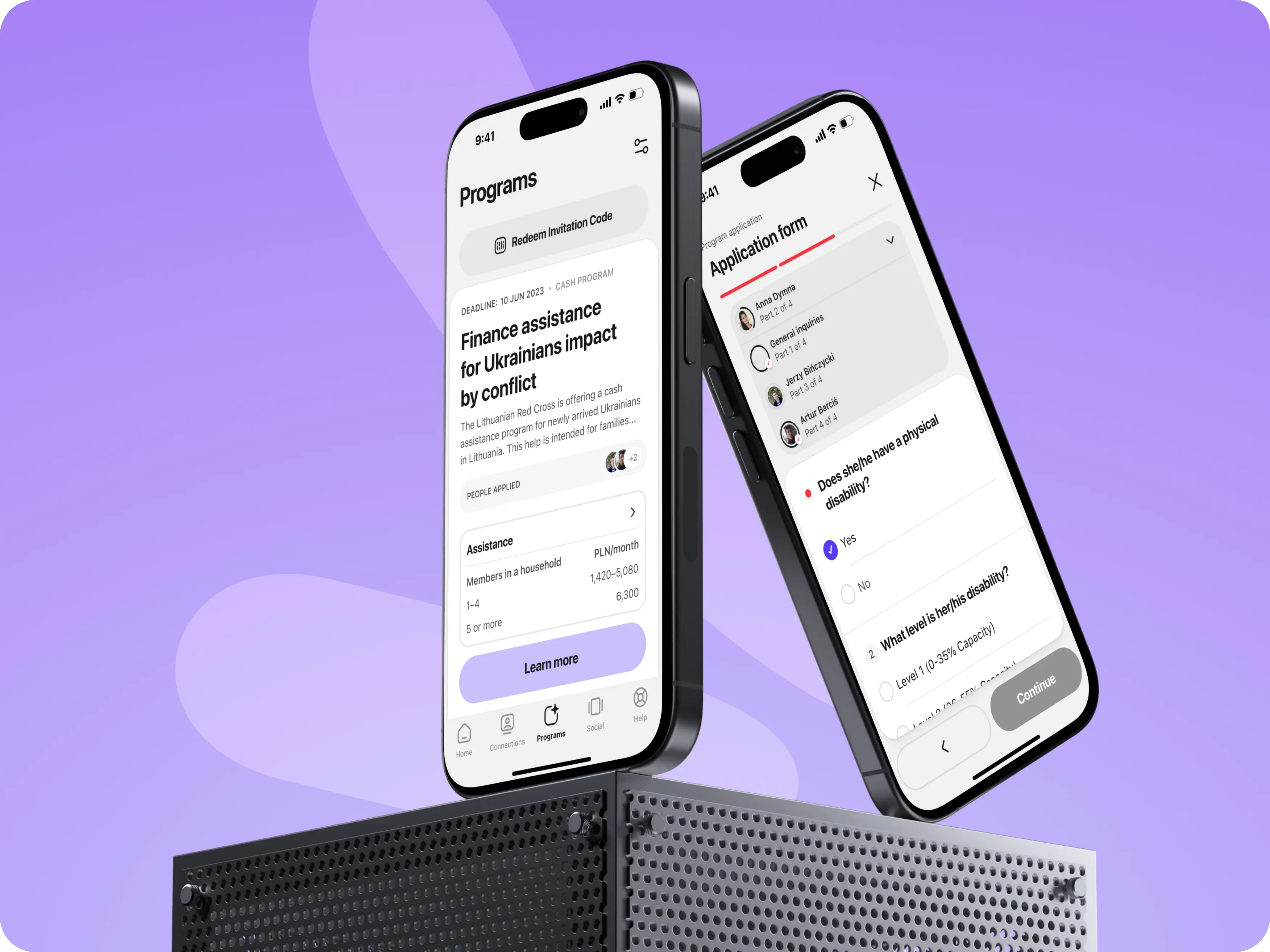
The program application process was designed with the 4 golden rules in mind:
- Knowing where you are.
- Understanding what you can do next.
- Being aware of where you are going.
- Being able to look back.
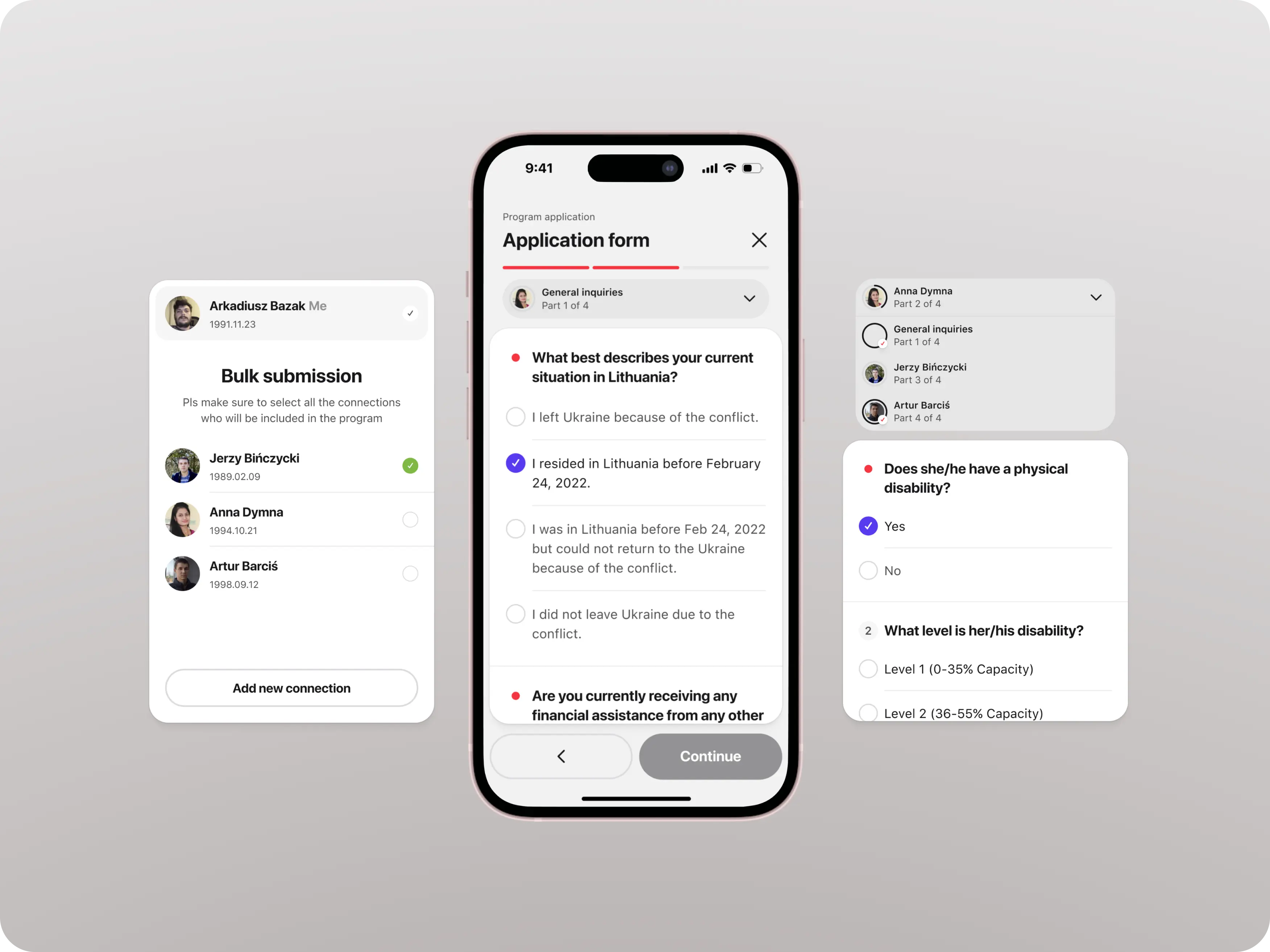
Flexy designers improved the application form by eliminating visual noise, adding clear spacing with a well-organized layout, and creating easy-to-read answer fields.
Although the form still requires scrolling, users always know where they are because key information (e.g. page title, which connection members are applying, and the current application stage) is fixed at the top of the screen.
Thanks to clear visual prompts and icons, users know what to do next. Their progress and upcoming steps are shown in a progress bar anchored at the top. They can also go back or edit their answers at the summary stage.
Encouraging Connections
As mentioned earlier, users need to understand what is expected of them. If they don’t, they may be discouraged from taking action.
The challenge was to create a well-structured design that would include all the security verification steps without overwhelming the user. To achieve this, our designers focused on clarity and simple navigation.
To transform the original “My Family” page into a user-friendly and predictable “Connections” page, Flexy designers used size, contrast, and color to make interactive targets (buttons) look clickable.
To simplify navigation and reduce the number of screens users need to fill out, we implemented a horizontal menu that opens different sections without leaving the verification screen.
In addition, to make adding connections even easier and more modern, the client requested a QR feature. We designed it as a modal window that temporarily covers the screen.
Accessibility at the Heart of the IFRC
In our design, we adhered to the IFRC’s core principles—humanity, unity, and universality—ensuring the IFRC’s values were reflected in the application. Flexy created UX/UI interfaces that are fully accessible to people with disabilities and special needs.
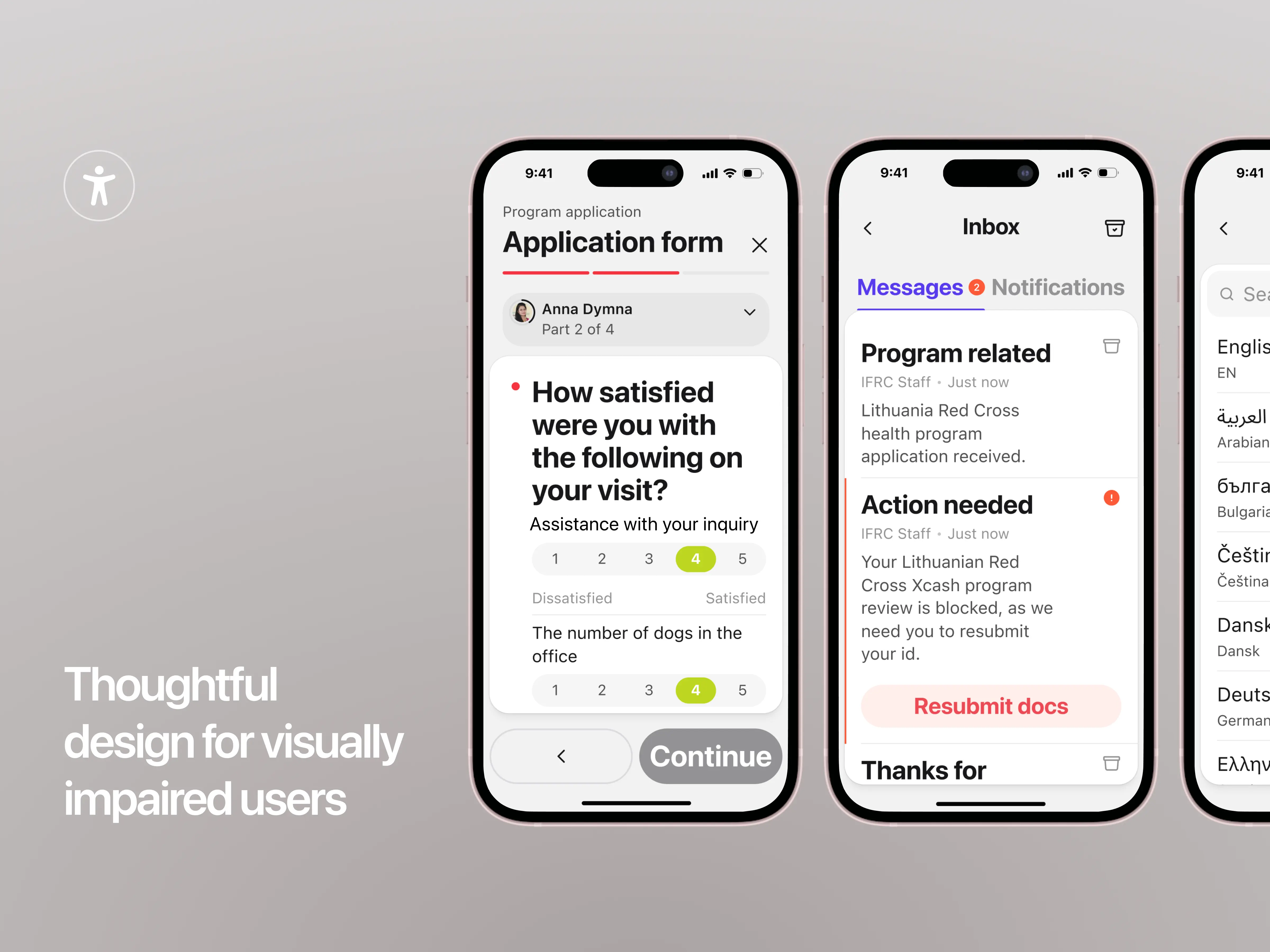
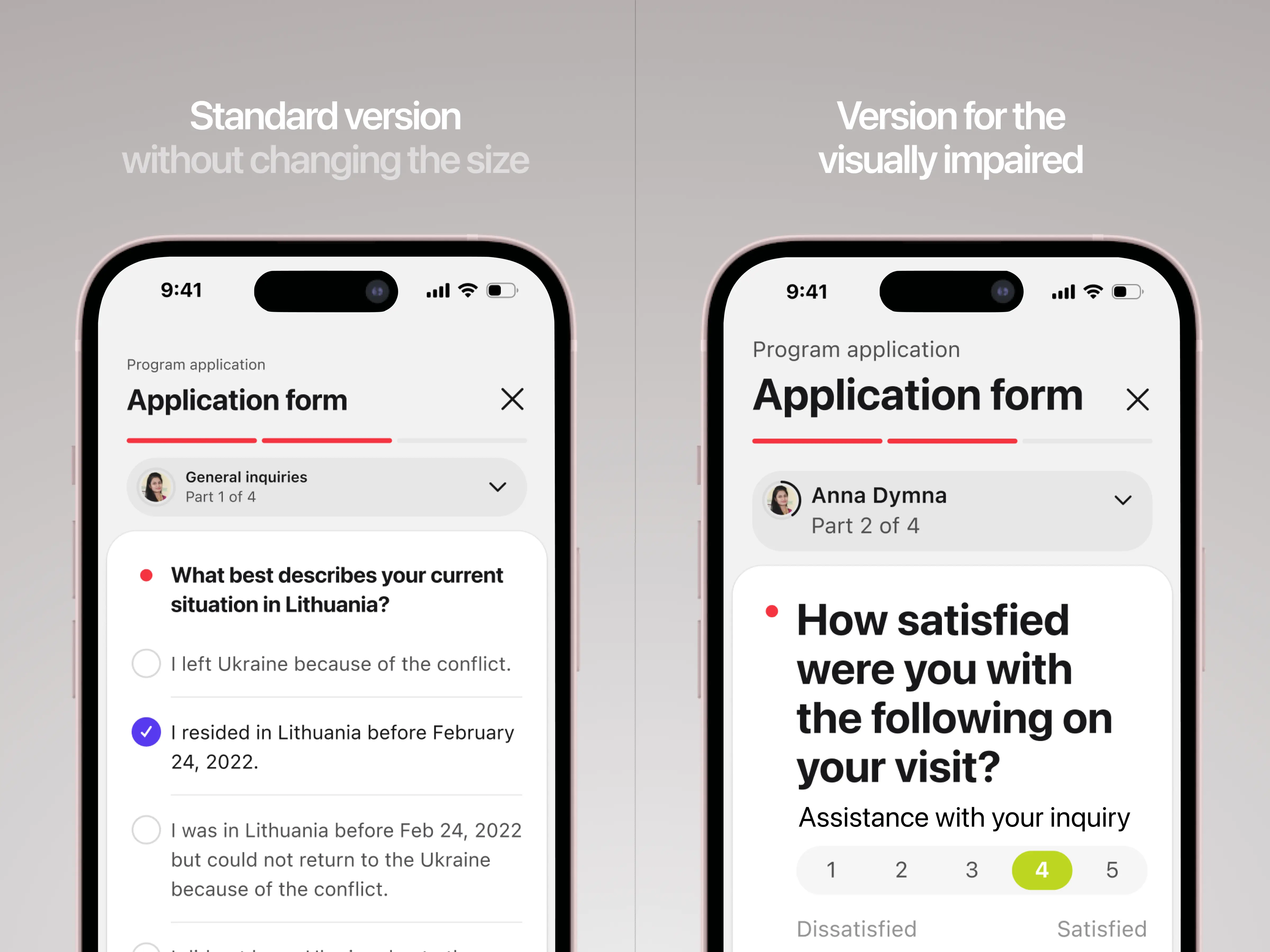
For example, users can easily enable a resize toggle that enlarges all text in the app by 1.5x for better legibility. They can also activate a colorblind mode, which adjusts the app's colors for different types of color blindness:
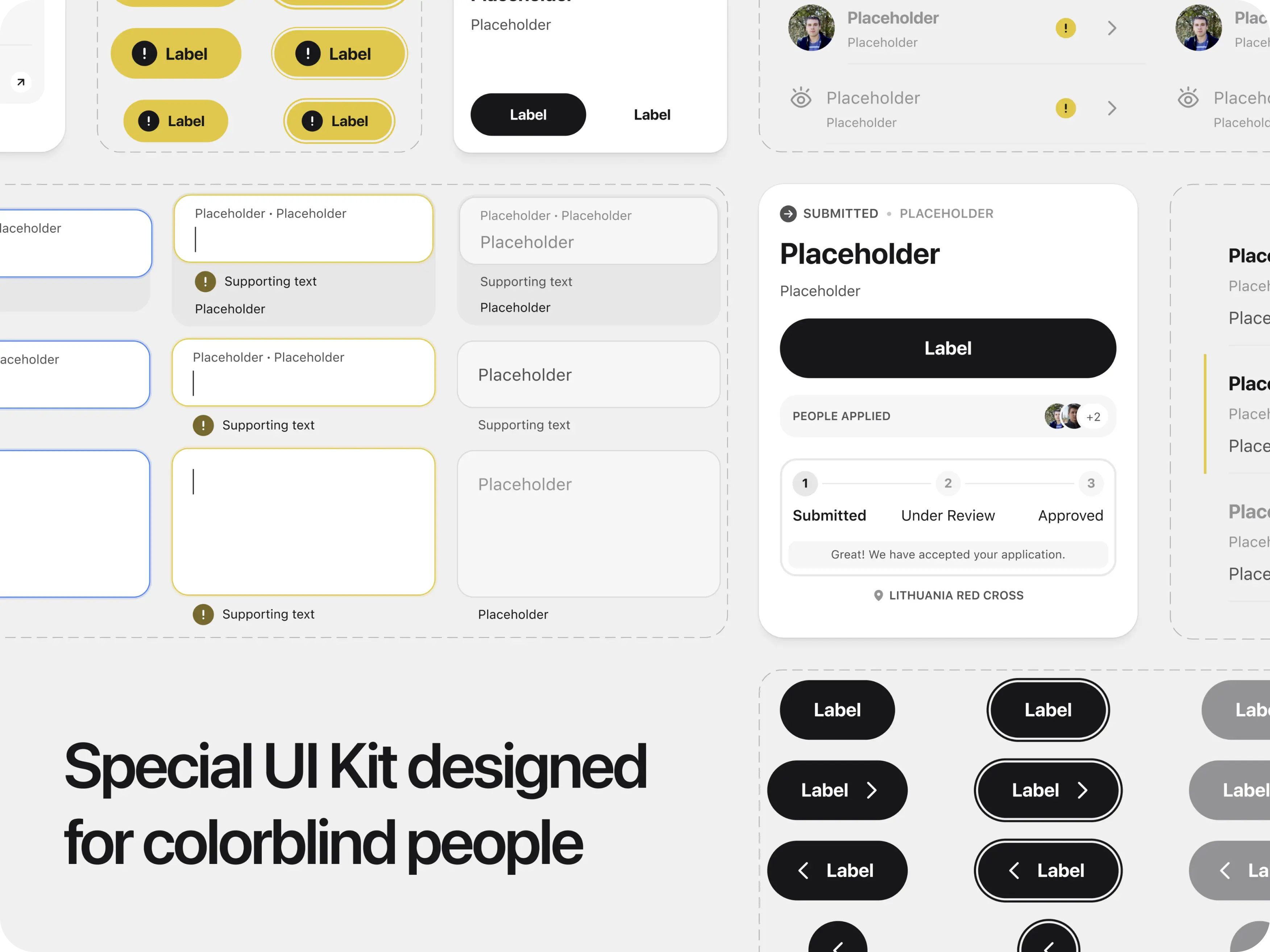
- Protanopia (difficulty seeing red light),
- Deuteranopia (difficulty seeing green light),
- Tritanopia (difficulty seeing blue light),
- Or red-green deficiency, where only murky blue and yellow are visible.
After researching colors suitable for various types of color blindness, we replaced violet elements with shades of grey and mustard yellow. Red and blue are still used in the colorblind mode, but only for less important features like input field outlines.
{{slider-cms}}
Illustrations for a Human Touch
Graphic visuals are crucial in UI design, they serve functional purposes, offering more than just aesthetics. Illustrations can act as action prompts and instructions, and create an overall positive and approachable image of an organization.
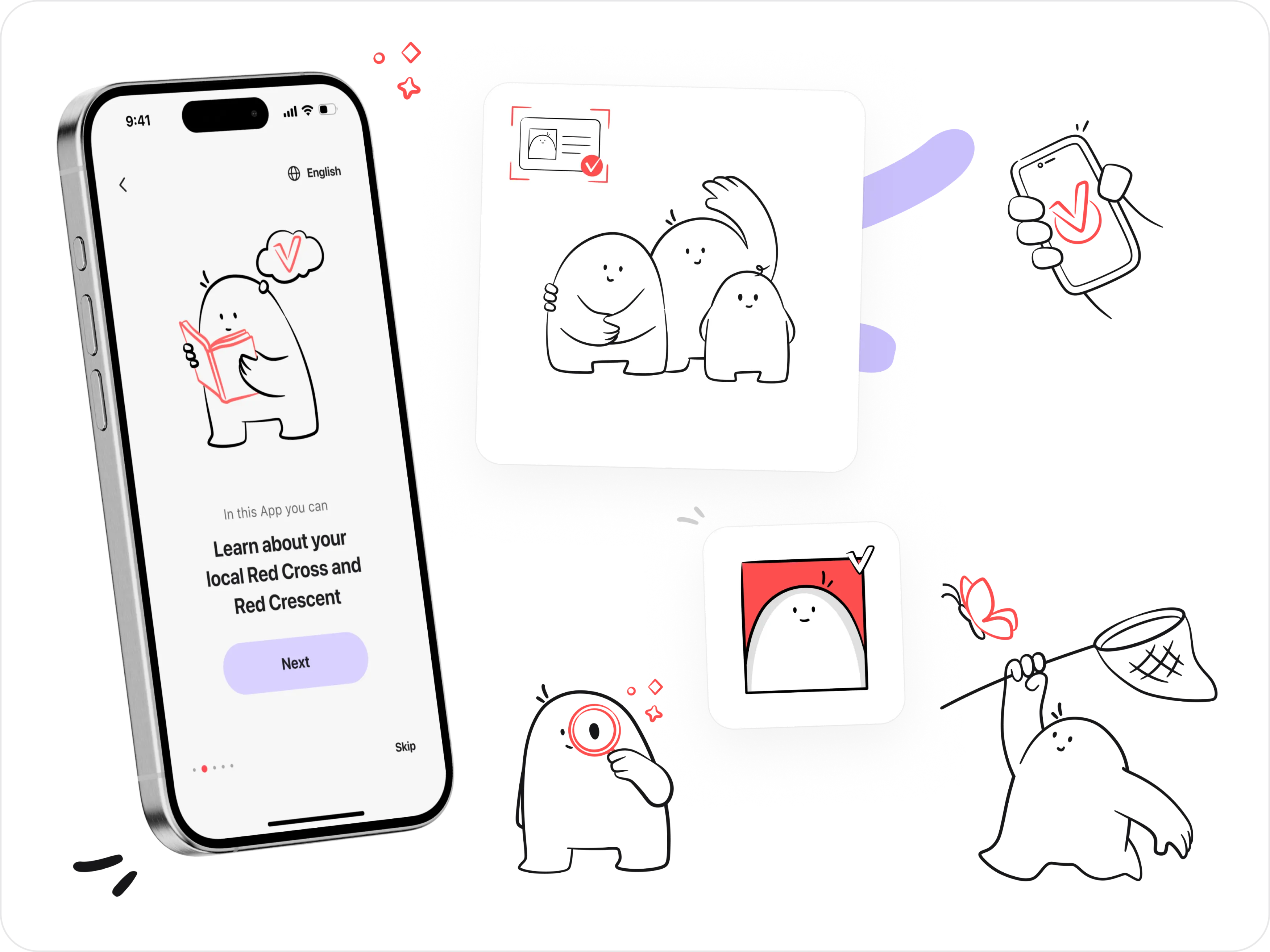
For the IFRC app, our designers created over 20 unique and engaging illustrations to boost user interaction. These visuals enhance storytelling, add visual appeal, and make navigation easier and more intuitive.
At the center of the design is a mascot—a small friendly character drawn in a simple, minimalist style. Its soft, rounded lines and cheerful expression create a sense of warmth and inclusivity, making it relatable and welcoming for users.
This playful character catches the user's attention and guides them toward their next steps, creating an intuitive and engaging experience while conveying the organization's values.
User-Centric UI Decisions
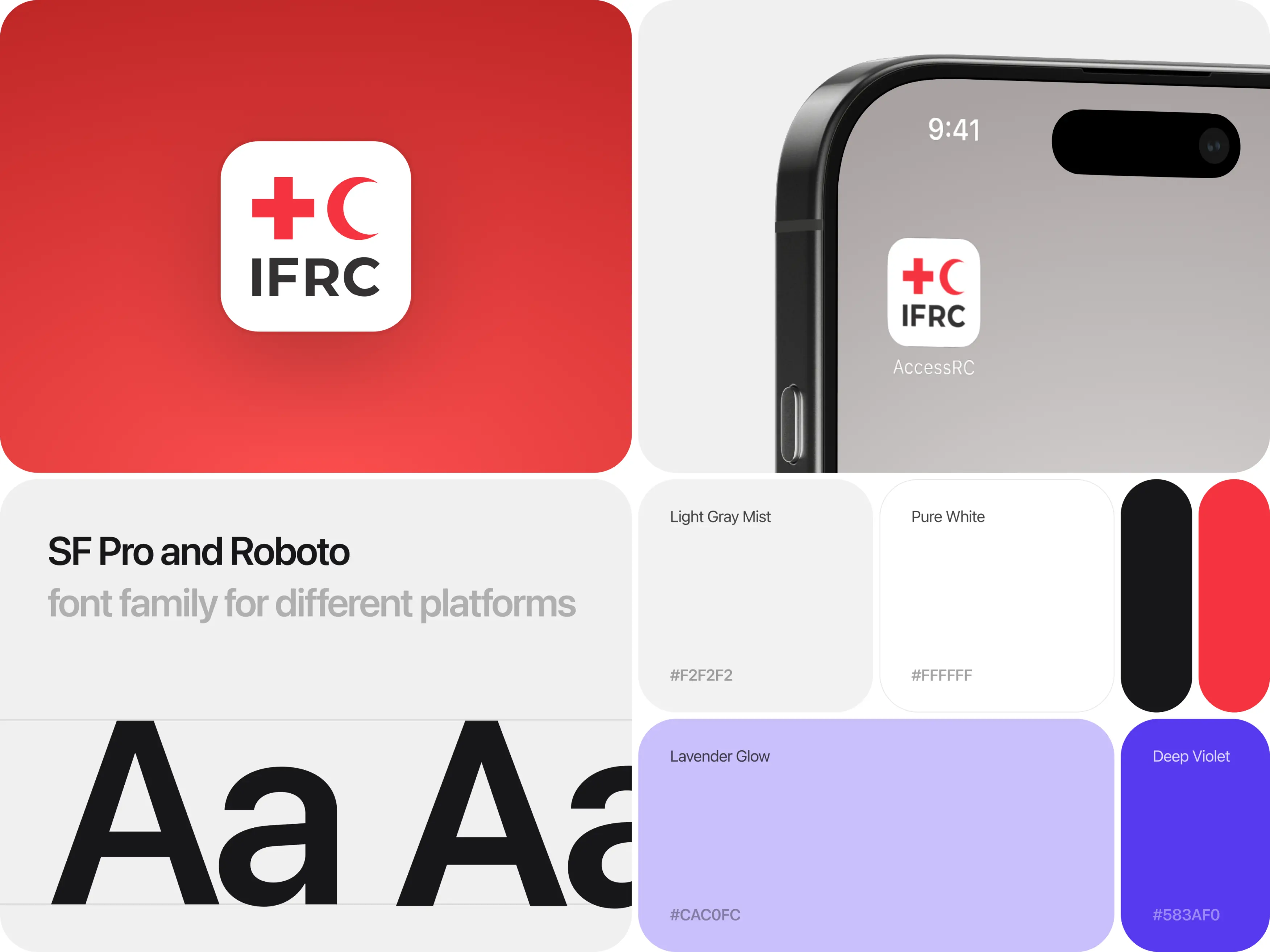
Our task was to redesign the IFRC application using the organization's main branding colors while reinterpreting red, traditionally linked to urgency and errors.
We presented our initial concept to the client, which was quickly approved, but we continued refining the colors to achieve the right balance.
Red symbolizes the Red Cross and other globally recognized groups. To avoid sending the wrong message with such a familiar color, we introduced a secondary color—violet. Violet adds a stable, calming effect that balances the active red and reflects the IFRC’s supportive nature.
A tremendous amount of work went into the project, including icon design, custom navigation controls, data display, and the creation of two complete UI kits.
Impressed with IFRC’s new look? Keep an eye on our updates — we’re excited about our next project with the IFRC, and we think you will be too!
