
Visual interface design is where creativity meets functionality. In a world where people use digital products most of the time, it is important to know how to build interfaces that capture a user’s attention and make them want to adopt your product.
That’s why it is important to know the top elements that can take your visual interface design from good to great.
Every element in a layout, whether it’s a button, text, or image, should ideally serve the purpose of making the user experience as seamless as possible all while making it visually appealing.
This article walks you through the top 5 elements to elevate your visual interface design and take your digital products to the next level. The elements are color, typography, layout, visual content, buttons and controls, and accessibility features.
Read on to learn about each element in detail!
In this article
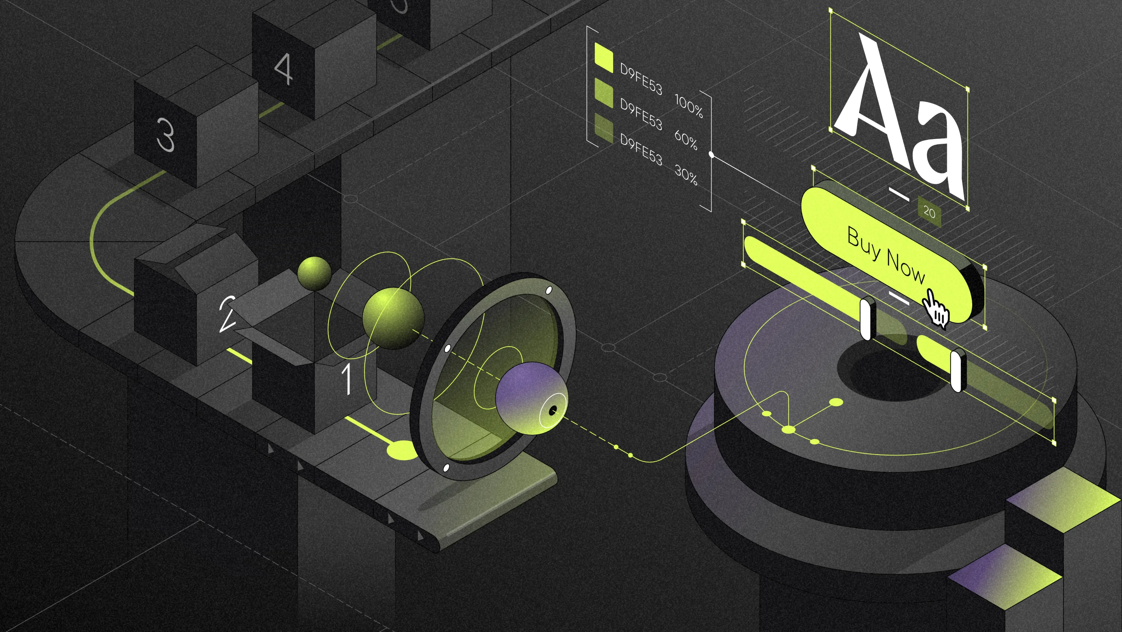
Color
Colors establish brand identity, enhance visual appeal, and create emotional appeal, which is why they are a crucial component of any visual interface design.
You can also employ colors to direct users’ attention. Red for error messages, for example, and green for success messages.
When it comes to visual interface design, color is really important, so you should take your time selecting your brand’s color palette.
To make a more informed decision, you can also dig deeper into color psychology. Did you know that green is associated with the environment and good health while orange, being a happy hue, is used to target young people?
Building interfaces that are both aesthetically pleasing and easy to use requires careful selection.
Typography
Typography goes beyond choosing the right font to improve readability. It is an essential part of visual interface design that conveys a brand’s personality, thereby influencing people’s perception of a product or message.
This is why it is critical to invest time in choosing the right typeface, size, and alignment. Each font type has a voice and tone that is embedded within the user’s mind on a subconscious level.
You might be asking yourself; what’s the difference between a typeface and a font? A typeface is a collection of fonts, such as Times New Roman and Comic Sans MS. To put this in practice, Roboto is a typeface while Roboto Bold is a font.
Layout
Layout involves arranging the visual elements and content within an interface in a way that improves the information flow, readability, and, of course, visual appeal.
A well-designed layout provides a perfect balance between functionality and visual appeal. The user should be ideally able to follow the correct flow of the information hierarchy presented within the interface, without experiencing friction because of an image that is loading slowly or a text whose font is too small.
Instead, you can be strategic and apply principles such as visual hierarchy and whitespace management to the layout of your visual interface design.
Visual content
Visual content such as images, videos, and illustrations can enhance storytelling, enrich a visual interface design, strengthen brand identity, and communicate complex ideas.
Whether it is a video that explains a process step by step, an infographic that summarizes a complex idea, or an illustration that accompanies a text, visual content is essential to a visual interface design that both enriches digital products and makes them more user-friendly.
It is also important to note that some people are visual learners, so providing visual content in addition to textual content can help you serve different types of learners, enhancing the functionality of your digital product.
Buttons and controls
Buttons and controls are elements that help users navigate and interact with your digital product.
There are many factors to consider when placing buttons and controls on a visual interface design, such as color, size, and placement. Also, there are many types of buttons and controls, and each one serves a specific purpose.
For instance, toggle buttons allow users to switch between two states, such as Bright Mode and Dark Mode or On and Off.
On the other hand, radio buttons allow users to choose one of many options. For example, Yes or No. Also, slider controls allow users to select a value using a slider. Users can use a slider to select a price range when online shopping.
Accessibility features
Make your design accessible to ensure usability and inclusivity to all your users. Accessibility features include alternative texts for non-text content, resizable text, high contrast mode for users with color vision deficiencies, and more.