It only takes a user 0.5 seconds to assess your website or app interface design and decide if it appeals to them.
So, essentially, the first thing your visitors do is judge the User Interface (UI) and how your digital product looks because it’s the first point of contact with your company. The more appealing and comfortable your UI looks and feels, the more likely they are to stick around to find out what you have to offer. An understandable and transparent UI is one of the main contributors to lower bounce rates and longer session lengths.
View your UI as a series of signs that guide people through a park. You’d want to make sure they know exactly where they can find the cafes, playgrounds, and WCs, or else it would feel like the park is a maze.
Spend some time testing your interface design to make the UI user-friendly and engaging. To help you find some interesting ideas for your design, we gathered some great interface design examples and the design choices that drive user engagement.
In this article
What is Interface Design?
Interface design is the process of creating the virtually tangible part of websites and apps that users interact with. It’s the visual elements that determine how your users engage with your company.
Back in 1973, when computers first started, the interface design was rather basic, consisting of text on the screen. But in 1975, Xerox engineers demonstrated the first use of icons and pop-up menus, which was the beginning of modern UI.
We went from typing commands to clicking on icons, and now we have new tech with a range of interactive interface design examples from digital products on touch screens to viewing products in 3D using VR.
What should an Interface Design have?
Without going into too much detail about the core pillars of interface design, here are some UI/UX features and qualities a user-centric interface design should have:
- Clarity
Everything that appears on the screen should be scannable, from the fonts used to the icons and sections. Your users shouldn’t have to guess how to navigate your digital product. - Simplicity
Your interface design should be decluttered, easy to understand, and have no unnecessary elements that could distract or confuse the user. Remember, the best designs are simple. If in doubt, strip the UI down to the bare minimum and work from there. - Consistency & responsiveness
The modern person has an average of 3 devices used interchangeably or even simultaneously and users expect to have a consistent digital experience across platforms and screens. - Accessibility
You may be targeting a specific demographic but one cannot guarantee who visits your site and the needs they may have. This means that things like color contrast, image alt text, labels, and font sizes to accommodate the needs of users with visual impairments or other disabilities. - Feedback
To make your interface design engaging, you need to make sure your users receive feedback for their actions. Communication is a two-way street, so, the better your company interacts with its users, the more people will trust you and understand that their actions are being registered. E.g. A user clicks a button and a message appears confirming that a form has been submitted. - Reduced Memory Load
Keep in mind that the easier it is for users to find the information they’re after, the happier their experience will be. Keep the interface design well-structured and only display the most important products or features on each page to avoid overwhelming the user. - Easy Action Reversal
You might get caught up thinking of all the aesthetic and structural parts of your interface design but we mustn’t forget about keeping everything functional. Users shouldn’t think twice when navigating your digital product and that includes action reversal. There should be clear options allowing users to quickly undo their actions with simple “Back/Undo/Redo/Scroll-to-the-top” elements.
10 Interface Design Examples That Encourage User Engagement
01. InVintory
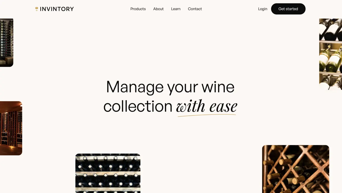
InVintory is an AI platform for wine lovers and collectors who have trouble managing their precious drinks. The brand has a website promoting its products as an information hub for potential customers to explore, which is the interface we will focus on.
Why it works:
- Intuitive Navigation: In this example, the company has an easy flow from one section to the next, which is coupled with an intuitive structure that invites users to explore the app's features and potentially convert.
- Elegant UI Design: InVintory’s interface design reflects the sophistication of wine culture, with a luxurious color palette and clear UX that appeals to amateur and seasoned collectors.
- Engaging Animations and Interactions: This interface design example exhibits over 10 animations, including a captivating 3D visualization of the wine cellar and subtle hover effects.
- Custom Illustrations: The illustrations help build the brand image and connect with users through the site's storytelling.
02. Zara
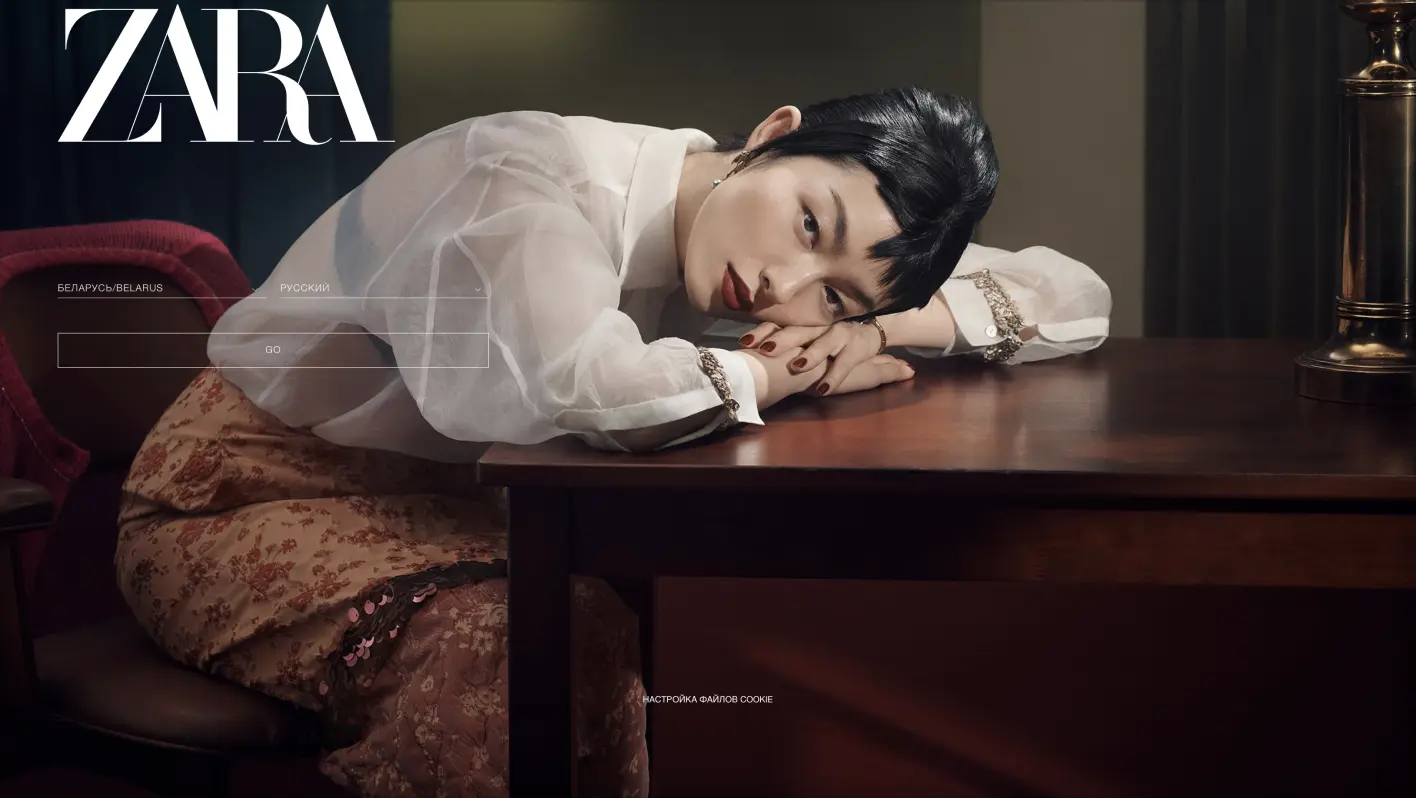
We’re sure you are familiar with Zara, the mass-market fashion brand. But have you taken the time to analyze its website interface design? The official Zara site turns online shopping into an elegant experience by showcasing their modern clothing collections, prioritizing quality imagery and usability.
Why it works:
- High-Quality Carousel Images: This interface design example uses rotating images on the homepage to showcase the latest collections, creating an engaging visual narrative.
- Hover Effects: Implements subtle animations when users hover over product images, providing immediate feedback and enhancing the browsing experience.
- Filtering System: Offers an intuitive filtering feature that allows users to easily narrow down their search based on size, color, and style, simplifying the decision-making process.
03. GenocideEdu
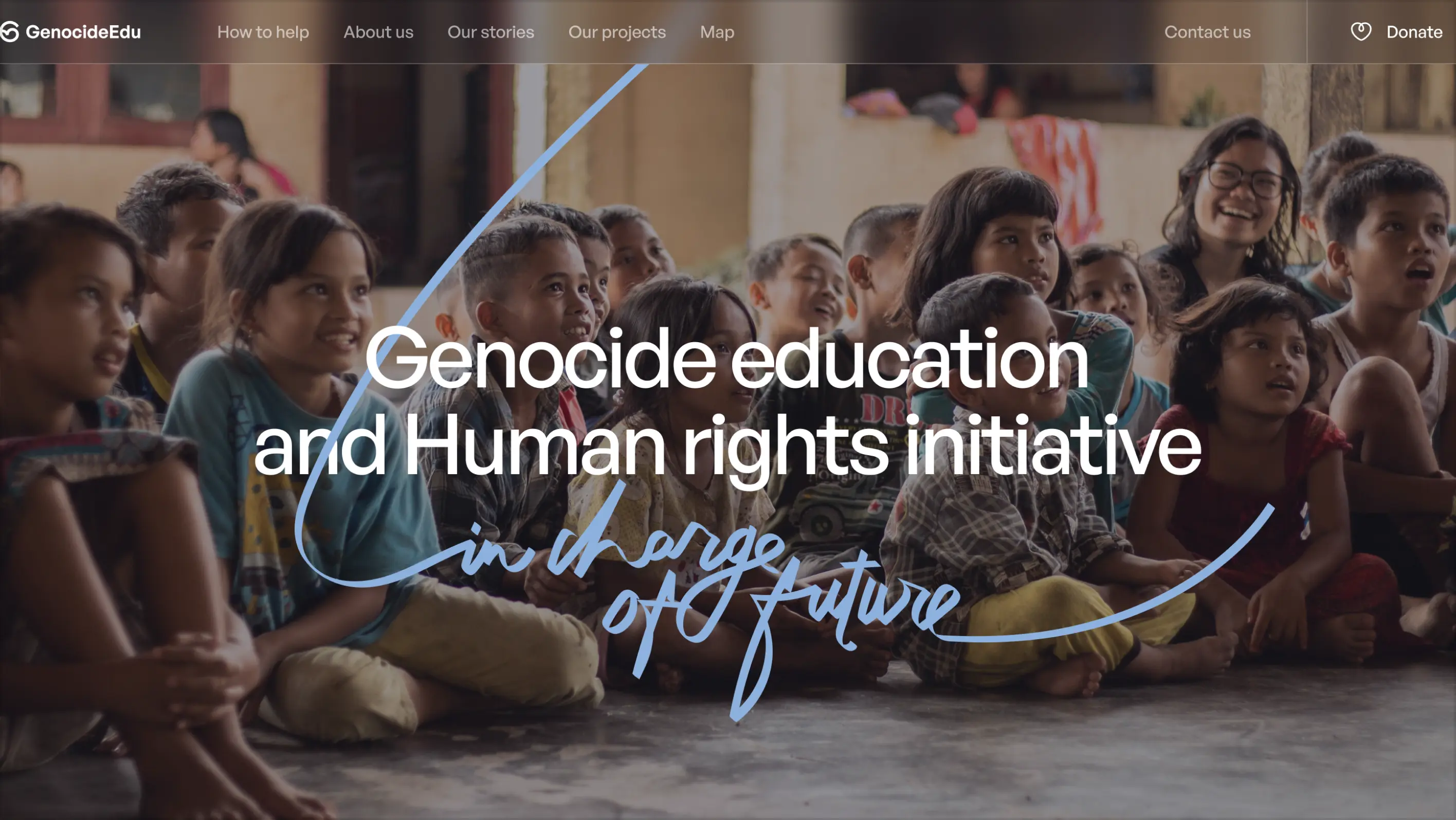
GenocideEdu was created to help youth affected by genocide and living in conflict zones, this NGO provides essential education resources, while working tirelessly to raise awareness about the effects of conflict. Their new polished UI design is a great example of how delicate topics can be presented in a transparent, interactive, and enlightening way through storytelling.
Why it works:
- Clear and Accessible Design: The UI/UX design strikes a delicate balance, offering a clear and navigable interface that handles sensitive content with the respect it deserves.
- Animation and Motion Design: Utilizing scroll-triggered animations and calligraphic touches, the website provides an immersive experience that captures visitors' attention and encourages prolonged engagement.
- Engaging Homepage Layout: Designed with a hierarchical structure, the homepage efficiently guides users through GenocideEdu's mission, values, and achievements.
- Interactive Storytelling: The inclusion of an interactive map connects users with the geographical context of the stories and reports, bridging the gap between the audience and the subjects of GenocideEdu's work.
04. Notion
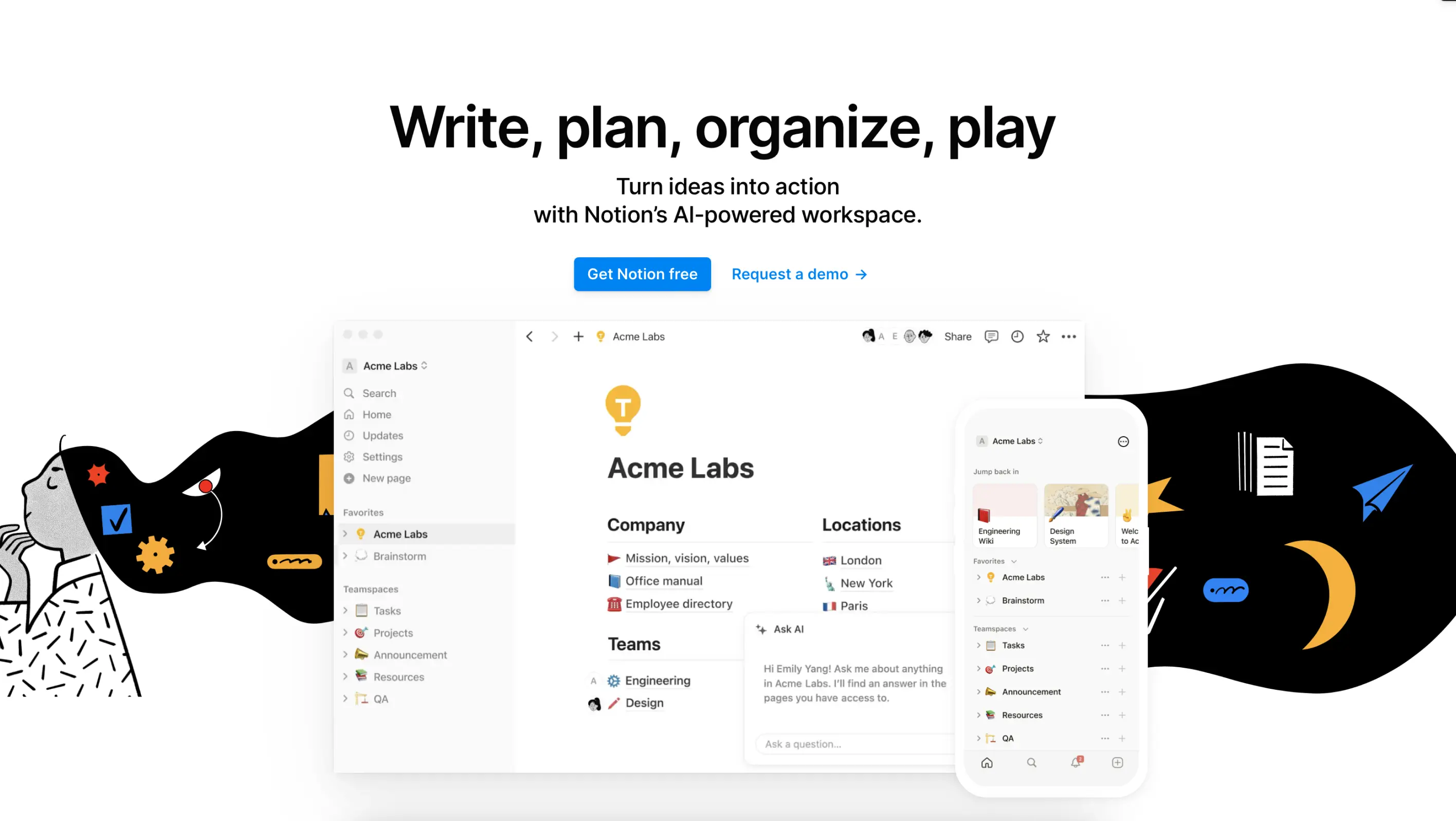
Notion is a multipurpose platform that provides a workspace for taking notes, journaling, planning, collaborating with coworkers, and managing projects. It is a digital pocketbook that has a very low learning curve, which makes its interface design welcoming and intuitive..
Why it works:
- Drag-and-Drop Interface: Notion allows users to easily organize their notes and projects through a tactile and interactive experience. By removing obstacles that would otherwise make the platform a nightmare to use, the company provides a highly competitive, user-friendly product.
- Flexible Customization: This interface design example also encourages its users to customize by providing flexible templates that prompt users to explore and make them their own.
- Interactive Tutorials: The onboarding process and guided walkthroughs are very effective at engaging users, nudging them to interact directly with the UI, and learning by doing.
05. Mailchimp
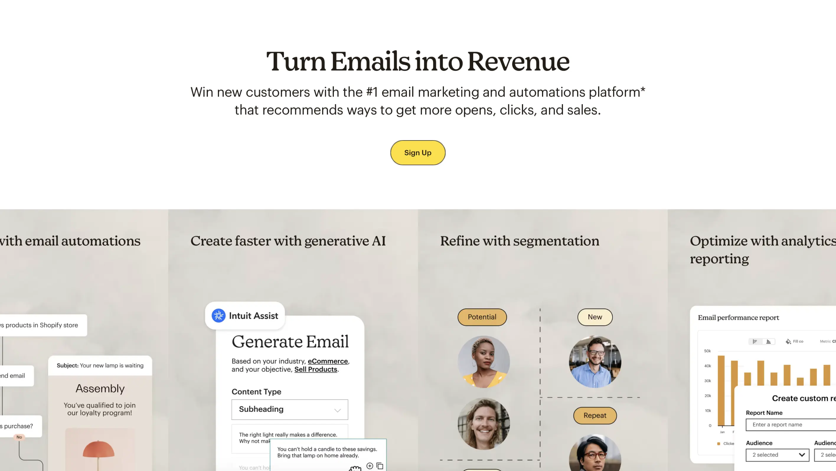
Mailchimp is a marketing automation platform that helps businesses manage their customers and talk to their clients. Its interface design is easily accessible, friendly, hierarchical, and focused on making elements visually recognizable.
Why it works:
- Animated Features: Mailchimp uses playful animations on its homepage that draw user attention while explaining all the benefits that come with a subscription.
- Friendly Feedback: This interface design example has a feeling of being at ease and having a casual conversation with the brand because of their attention to user pain points. E.g. In case of an error, Mailchimp displays friendly and humorous illustrations alongside helpful prompts.
- Interactive Pricing: The interface design acknowledges that users may have different customer base sizes and therefore different needs. Mailchimp makes the pricing section interactive to engage visitors and help them find the optimum solution based on the number of contacts they have and the features they require.
06. Slack
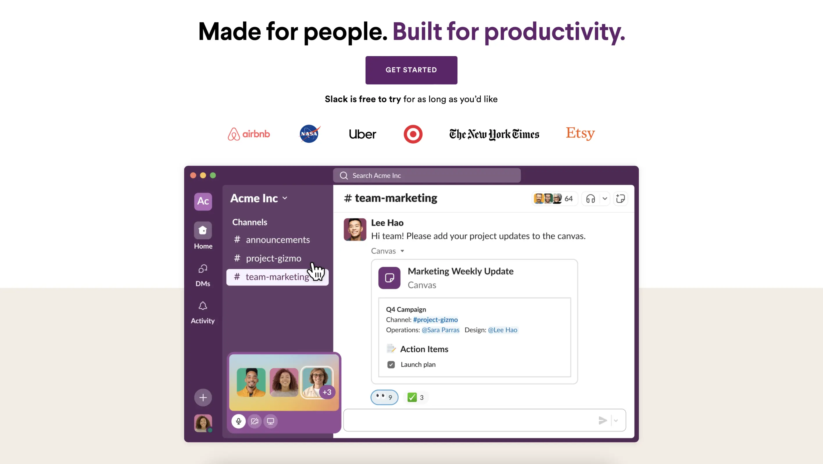
Slack is a cloud-based team communication platform that makes long-distance project management across departments easier than using a social media platform. The principal features of their interface design are flexibility and structure.
Why it works:
- Customizable Sidebar: Slack lets its users organize the channels and direct messages based on their preferences.
- Immediate feedback: This interface design example makes sure the user knows exactly what the app status is and if there is a problem an alert will inform the user about what they should do next and which links can be used to find assistance.
- Progressive Disclosure: Keeping the dashboard and chats organized is highly important for businesses using the platform, which is why the interface design lets users collapse unnecessary features and tabs, keeping the interface clean.
07. Duolingo
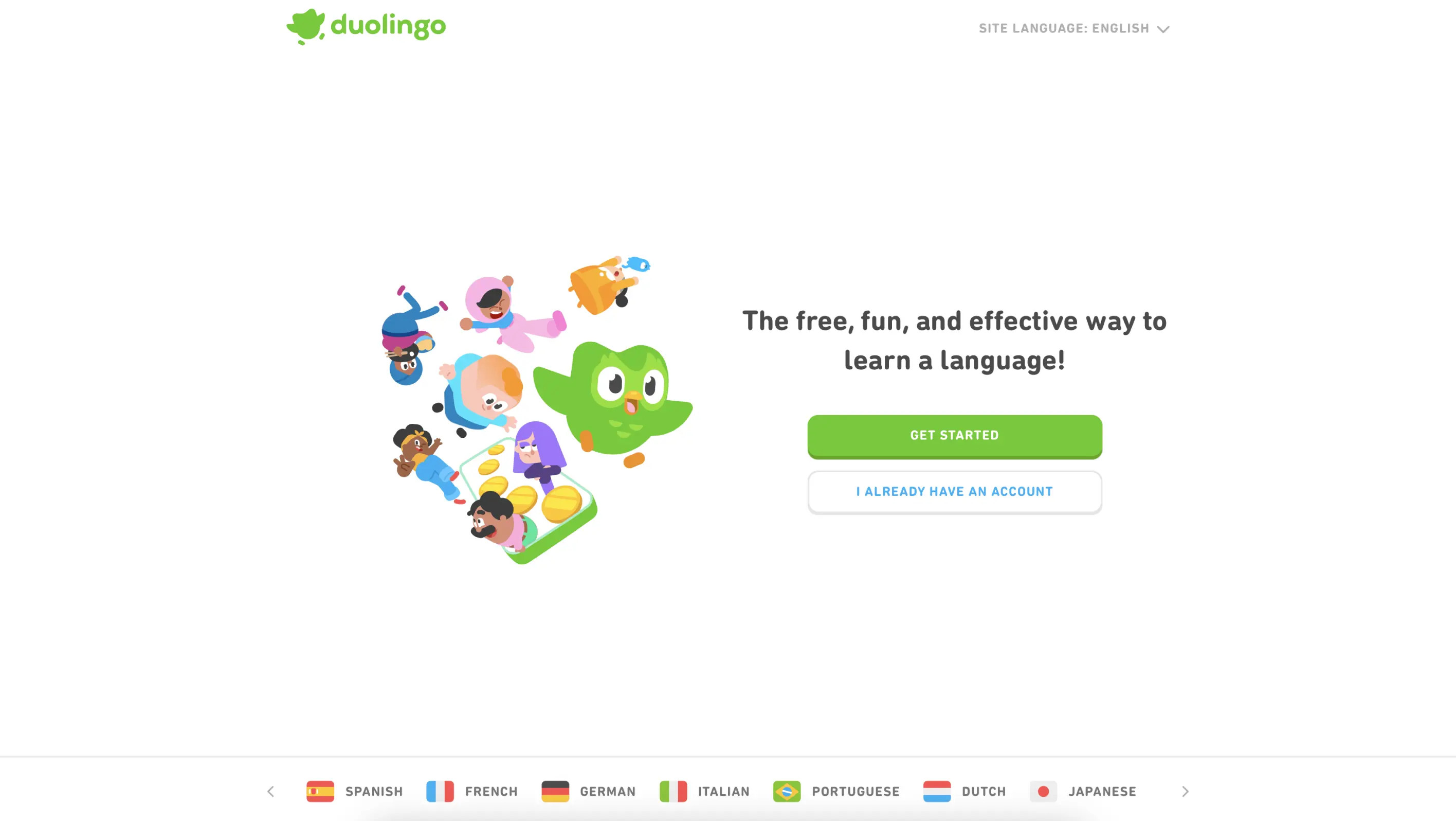
Duolingo is an educational technology company, known for its intimidating green owl learning partner, Duo. The application provides lessons for 40+ languages to over 500 million users, which means the UI and UX need to be highly motivational, interactive, and user-centric.
Why it works:
- Progress Bars and Levels: Duolingo makes sure users can visually track their progress appealingly and simply, with bars that fill up as you advance, and levels that unlock new challenges.
- Streak Count: This interface design example involves a lot of gamification to reduce abandonment and encourage its users to continue their lessons. This is done by displaying how many days in a row the user studied and motivating them to return to maintain their streak.
- Consistency: While users do not know what question they will be asked next, there are set structures for how they answer reading, writing, and listening questions by dragging blocks, tapping, or saying words out loud. This adds a sense of security while learning an unfamiliar language.
08. Webflow
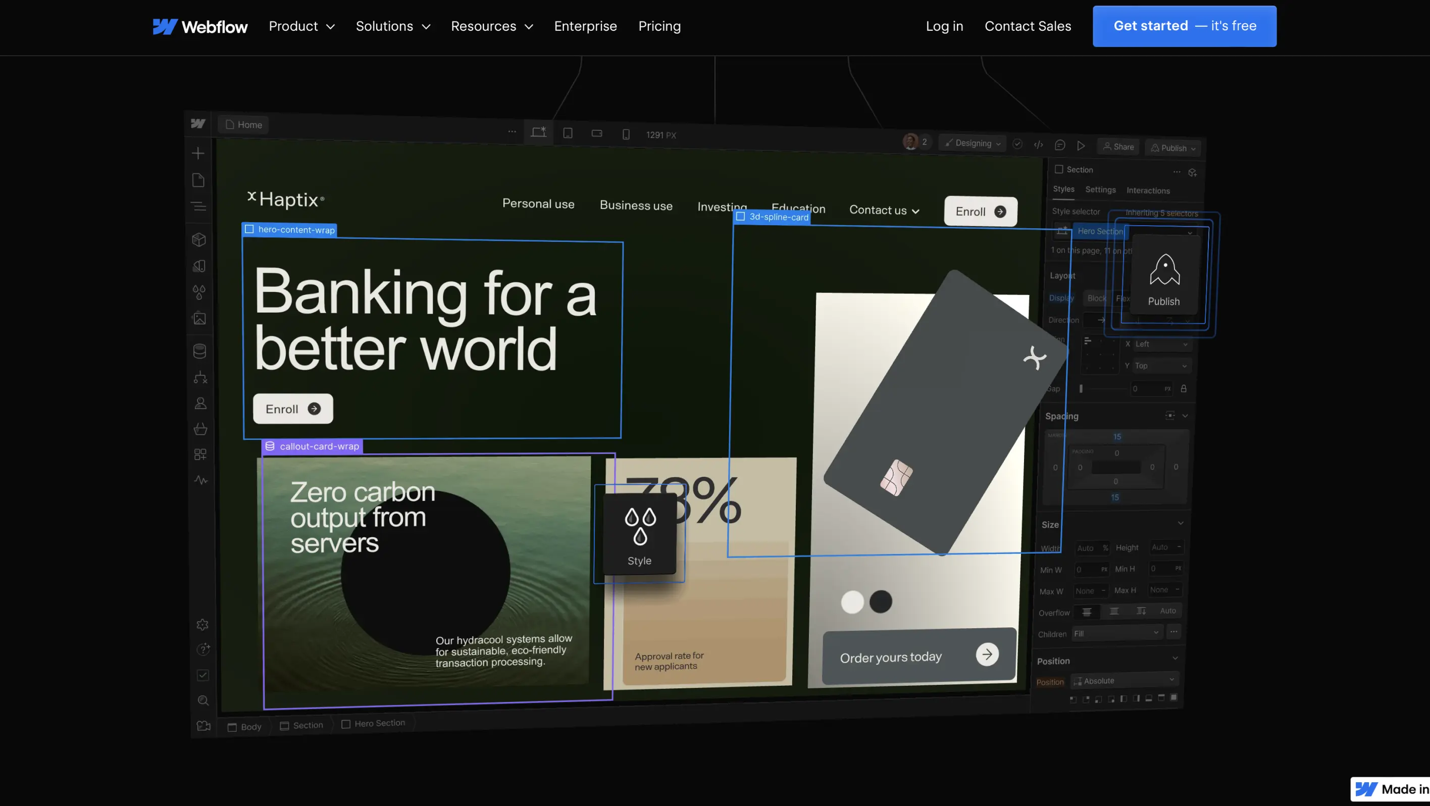
Webflow is an American web design and hosting software that enables people to build and launch responsive websites without knowing any coding. The platform’s interface design has pre-set templates but users also have complete control over the layout and navigation.
Why it works:
- Visual Coding Interface: Webflow bridges the gap between users who have no coding knowledge and professional design and development. It has a user-friendly, simple drag-and-drop interface design so that new users can go live in the shortest time possible.
- On-Canvas Editing: Users can easily and efficiently change text directly on the website canvas.
- Real-time Preview: The great part about this interface design example is that users can instantly preview their website design before launching with just a click of a button.
09. Discord
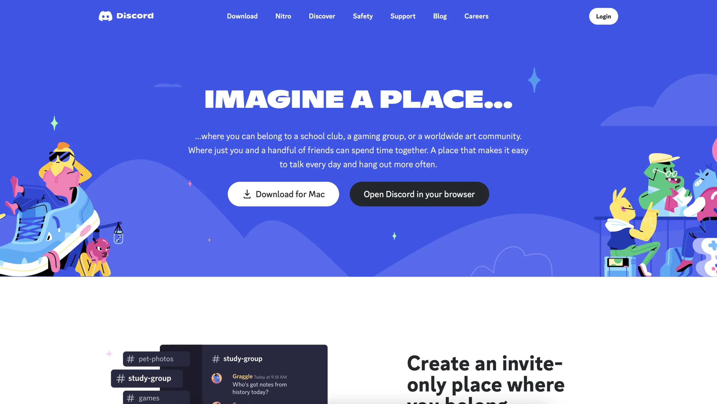
Discord is an instant messaging social media platform that is mainly used by gamers who enjoy the advantages of the platform’s straightforward text, voice, and video chat features. This platform is the perfect environment for common interest groups that have their server, where users can communicate in private or public channels.
Why it works:
- Customizable Interface: Discord’s interface design has a great deal of flexibility, allowing users to make the platform more personal.
- Intuitive Navigation: Discord has a clear, organized structure with easy-to-access channels and servers, reducing cognitive load and making information retrieval effortless.
- Service Integration: The platform integrates with other platforms like Twitch and Spotify, keeping video chat bubbles off the screen for convenience.
10. ViciousCurl
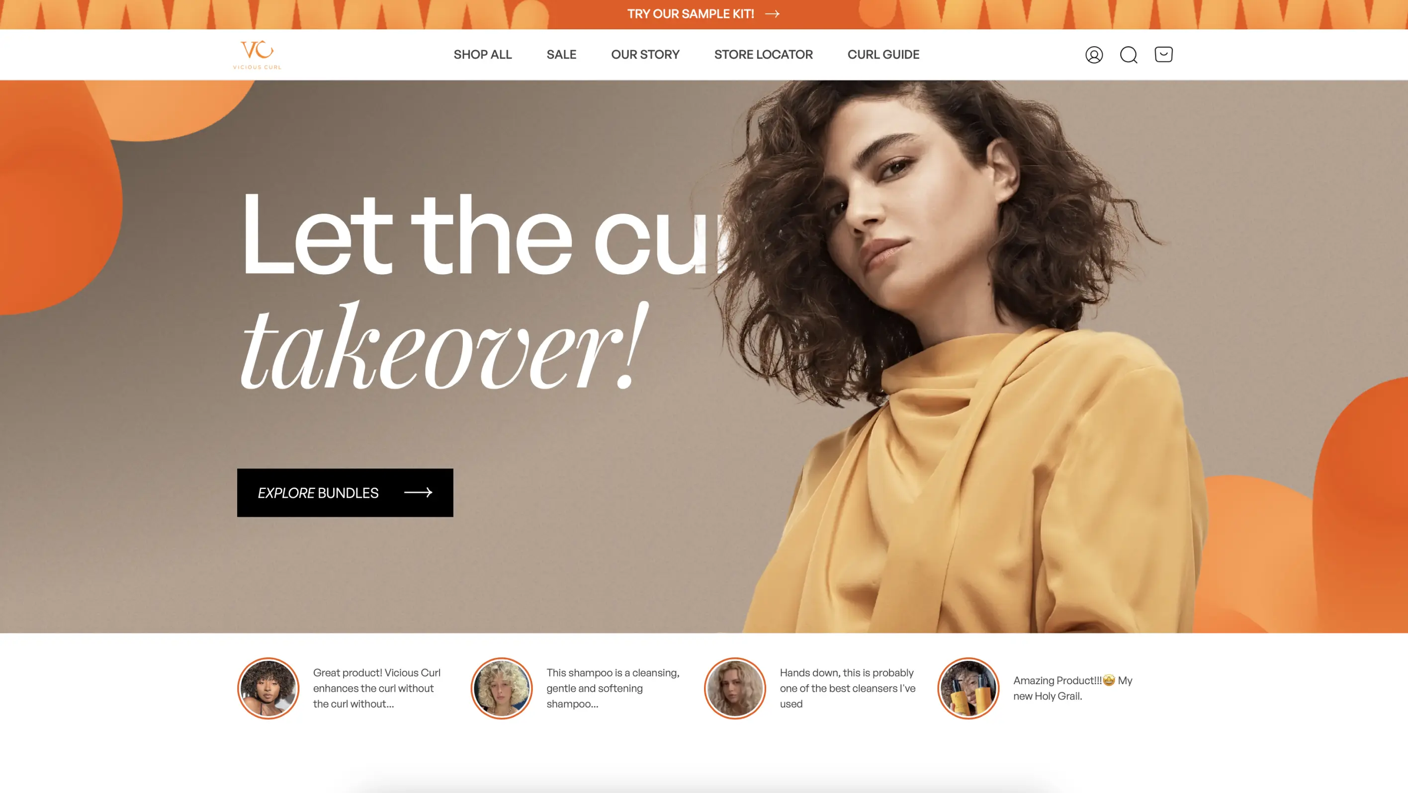
ViciousCurl is a hair-care brand that offers cruelty-free products for all curly hair types from 3S to 4C. Their e-commerce website recently faced a Vitamin-C-infused redesign that better reflects the brand values and boosted sales.
Why it works:
- Interactive Quiz: ViciousCurl needed to make sure visitors had no trouble finding the right product for their hair type, so, their homepage included a quiz that offered product recommendations.
- Simple Navigation: The hair care brand has immediately accessible filters that cut the time it takes to browse and add goods to the cart.
- Spacious UI: ViciousCurl sports a spacious interface design with medium-sized images and ample negative space to help focus user attention on product descriptions.